Jean Prouvé: life and work

Jean Prouvé was a highly regarded member of the outstanding group of French Architects, Engineers and Fabricators working in the mid-20th Century. Born in Paris on 8th April 1901, he lived until the age of 82 and died on 23rd March 1984.

Jean came from a very artistic family. His father, Victor Prouvé, was a well-regarded artist and also a furniture designer and his mother, Marie Duhamel was a pianist.

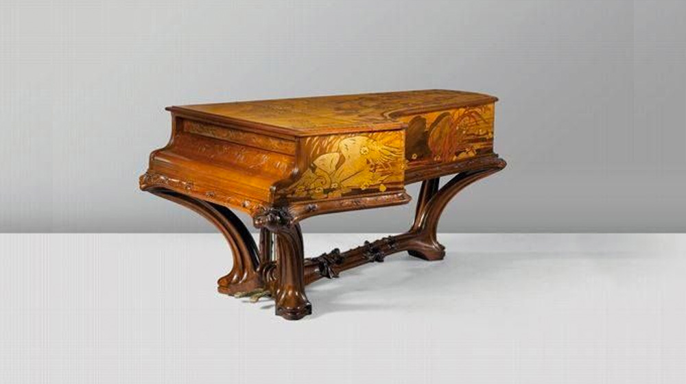
“La mort du cygne” Piano by Victor Prouvé

“La mort du cygne” Piano by Victor Prouvé

Early career and L’ecole de Nancy

Jean’s father belonged to the art collective called, l’École de Nancy. The simple goals of the collective were to make art accessible to all the varied classes of society and to ensure that lasting links would be forged between art and industry. Other members of the group included the noted furniture designer Louis Majorelle and the genius glass artist Emile Galle.

After studying for three years in the School of Fine Arts in Nancy, Jean started his artistic career as an apprentice blacksmith with Emile Robert close to Paris. After leaving his master, Jean went to work for M. Szabo, who owned a metal workshop in Paris

Logic, balance and purity

The apprenticeship under M. Szabo gave Jean an understanding of metal fabrication at its purest level. He could see the value in simple shapes and forms, and he could appreciate the beauty of simple items. Jean used the skills he had learned as a blacksmith, in his architectural projects as well as his industrial design. He lived his professional life under the motto ‘logic, balance and purity.’

Return to Nancy

Jean returned to Nancy in 1923, where he opened his first workshop. The workshop included a forge, and among his early products were wrought iron lamps, chandeliers, and simple utilitarian furniture. As his career continued he moved away from wrought iron, to sheet materials which he could fold into almost any simple, structural, architectural element. The chairs in the images have strong structural and architectural design elements.

Jean’s training as a blacksmith drove his interest into easily made, repetitive components. During the mid-1930’s he was producing pre-fabricated schools, hospitals, and even office buildings. He also expanded his offering to include prefabricated service/gas stations.

The interiors below show a strong influence from the components of his chair designs.

The image on the left shows the Jean Prouvé Standard SP Chair Powder-coated sheet & tubular steel frame, ASA plastic (fine textured) seat/back Made in Germany by Vitra Image from Hive Modern. On the right is the folding chair designed by Jean Prouvé 1928, made by Les Ateliers Jean Prouvé 1929, made with a combination of tubular steel and linen canvas. Image from Museum of Fine Arts Houston.

The image on the left shows the Jean Prouvé Standard SP Chair Powder-coated sheet & tubular steel frame, ASA plastic (fine textured) seat/back Made in Germany by Vitra Image from Hive Modern. On the right is the folding chair designed by Jean Prouvé 1928, made by Les Ateliers Jean Prouvé 1929, made with a combination of tubular steel and linen canvas. Image from Museum of Fine Arts Houston.

Aluminium House and World War II

Jean Prouvé Metropole Alluminium House 1949. An all-steel structure consisted of two load-bearing portal frames which left the interior free to be used as required. Image from Gallerie Patrick Seguin

Jean Prouvé Metropole Alluminium House 1949. An all-steel structure consisted of two load-bearing portal frames which left the interior free to be used as required. Image from Gallerie Patrick Seguin

Jean Prouvé Metropole Alluminium House 1949. An all-steel structure consisted of two load-bearing portal frames which left the interior free to be used as required. Image from Gallerie Patrick Seguin

Jean’s lightweight design came in at under two tons. The building was 3.3 m2 (35.5 square feet) and remarkably could be put up or taken down by five workers in four to five hours. This type of clear thinking and design was also used after World War II to help re-home the millions of refugees around the world.

Jean was a politically active member of the French Resistance, and after World War II became the Mayor of Nancy. Following Liberation he was made a member of the Advisory Assembly

Sitting, I click, plotting new lines My surroundings are vague, blurry
They sit on the margin of my mind
I need another shot of expresso
Shapes and colors are all I see
Shaped spaces to fill my building’s voids

I sit supreme as ultimate ruler in my urban space
Sleep attacks me, trying to stop me
The dawn’s light, fills my room its pale gold beauty brings warmth to my face Dawn yet another new beginning for the city, I feel the history flow

The history I want to be a part of
I look outside and smile
Timber and steel filled with glass
Light and dark shadows on pavement, I designed Deadline almost missed, almost passed
I have to meet the client, they have a budget to meet, It is almost time to present

I can resent later
Once again the late, ‘late’ night’s work is done

the-architect-poem_01

Peter Marino – the man

Peter Marino is often in the news for reasons other than his architecture. His art collection – he wanted to be an artist before he decided on architecture as a career – is famously extensive as anyone visiting his Manhattan offices would be able to see for themselves.

Marino particularly admires Anselm Kiefer and owns around a dozen of his artworks and his collection of Bronzes was displayed as part of the Wallace Collection in 2010. Marino also hits the headlines for his personal fashion style which he describes as “tattooed biker”. This “look” consists of leather, studs, a leather cap, leather cross-braces reminiscent of the harness for a child’s reins and biker boots with chunky heels.

As well as art, Marino is inspired by classical music and he has said that he treats his interiors as a composer would approach the creation of a piece of music.

Dior

Marino does carry out residential design work for those who can afford it (typical commissions would be in the region of several hundred million dollars) but as these are kept under wraps, it is his work for the stores that gets the attention. Brands for whom he has worked include Calvin Klein, Armani, Vuitton, Zegna and Chanel attention but his work for Christian Dior is especially notable for being so often in the architectural and design magazines.

Marino’s practice is not a small one, it employs 180 people with more than 100 architects and although Marino says he doesn’t have a signature look his interiors are striking in their cohesion and integrity of style.

And indubitably springing from his love of art, his interiors are made all the more distinctive by the sculptural elements he integrates into his designs.

Dior in Omotesando Avenue, Tokyo

One of Marino’s renowned make-overs is of the Dior store in Omotesando Avenue in Tokyo, designed by SANAA in 2004. The store was remodelled in 2014 with the glass façade left untouched.

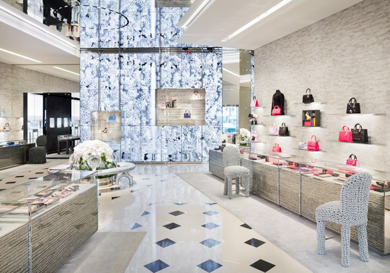
Using the Parisian Avenue Montaigne Dior store as a base version, Marino has created a silvery, light-as-air interior. As always, his love of art is denoted by his positioning of the merchandise singly or in small clusters, exactly as works of art, on the walls. Or, given Marino’s love of music, perhaps as musical notes as they are shown on a manuscript.

Christian Dior’s Tokyo store in Omotesando Avenue by Peter Marino

Christian Dior’s Tokyo store in Omotesando Avenue by Peter Marino

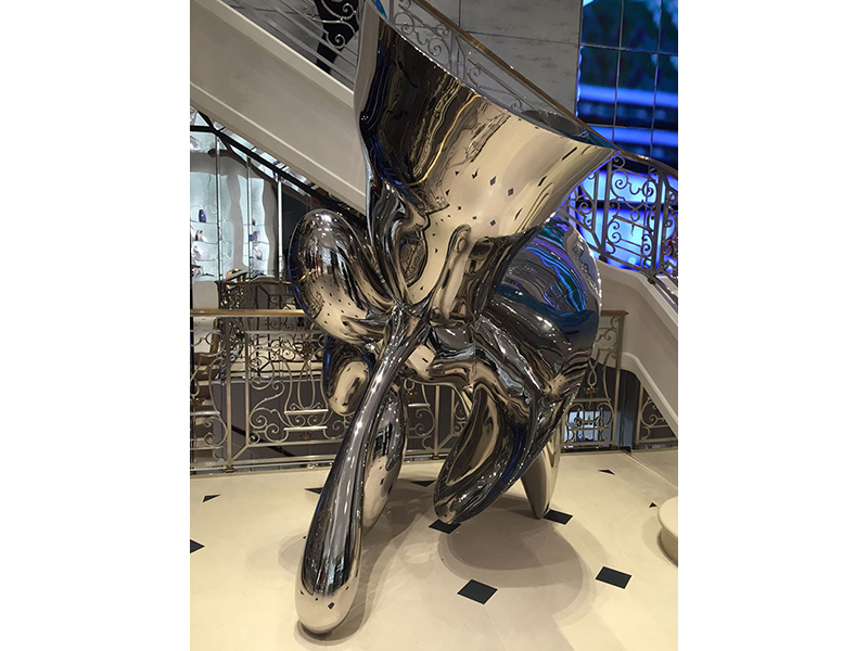
There are always sculptural elements in Marino’s work, sometimes actual sculptures as in his Bond Street store in London but more frequently his furniture pieces styled as sculptures, often designed by himself. In his Tokyo interior, the chairs appear to be crocheted and form a matt, lumpy and white contrast to the fairy-like textures in the remainder of the store. But in themselves, the fanciful nature of the chairs is perhaps just as fantastical as a fairy.

Showing sculpture positioned in stairwell, Christian Dior Bond Street store, London. Designed by Peter Marino

Showing sculpture positioned in stairwell, Christian Dior Bond Street store, London. Designed by Peter Marino

Dior, 464 Apgujeong-ro, Gangnam-gu Seoul, South Korea

The exterior of the Dior store in Seoul, designed by Christian de Portzamparc, is strikingly arranged as a tall, white lily flower although officially it is designed to appear as the draping of a skirt or dress as it is manipulated by its couturier.

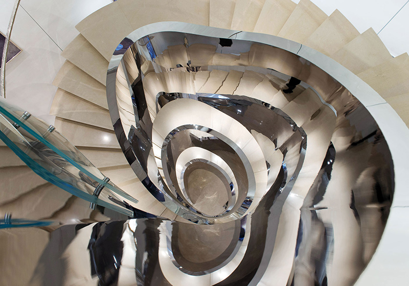
The interior, covering six floors and the biggest that Dior have in the world, can perhaps be described as a series of sculptures within the external sculpture. The stairs themselves form a sculptural core to the interior with silver fins that seem more likely to slice you into pieces than transport you to the next floor.

It may come as no surprise that this store also has its own art gallery which puts on shows by contemporary artists.

Looking down at the staircase, Christian Dior store Seoul, designed by Peter Marino

Looking down at the staircase, Christian Dior store Seoul, designed by Peter Marino

Christian Dior store, Seoul, showing the suspended sculpture by Korean artist, Lee Bul. Designed by Peter Marino

Christian Dior store, Seoul, showing the suspended sculpture by Korean artist, Lee Bul. Designed by Peter Marino

Playing with dark and light, security and danger

Two paths are before us. We take a moment to reflect on our way. Light is undoubtedly a decisive factor when choosing the course to follow. Western culture tells us that dark spaces are not safe, the vision is limited. When we look for a space where the main activity is dynamic or playful, we associate light as an inherent element or feature of these spaces. One would say the visitor would distance himself from the dark, although the 90 degrees inflection of the wall, the signs and the notion that the next space should be the bathhouse where we undress, encourages us to move to a more intimate and private area , to the closed zone.

Access to Swimming pool by Alvaro Siza, Leça da Palmeira, Portugal.

Access to Swimming pool by Alvaro Siza, Leça da Palmeira, Portugal.

Photography by Ana Lopes Ramos

The interior

Passing the screen we are in the changing rooms. Without this nucleus there was no entering the pool; it gives meaning to this architectural path designed for the subject in permanent transition, in movement. It is really from them [the changing rooms] that one is inside the pool. The space consists of single black wooden cabins reinforcing the idea of intimate, reserved, and dark space. The visitor can undress without any embarrassment. These cabins, arranged side-by-side, are attached to profiles, also in black wood, that will intersect and repeat creating a rhythmic composition and a clean and clear design. The structure of the detail makes the whole space.

Imposing interior of the Swimming pool building by Alvaro Siza, Leça da Palmeira, Portugal.

Imposing interior of the Swimming pool building by Alvaro Siza, Leça da Palmeira, Portugal.

Photography by Ana Lopes Ramos

The profiles and cabins acquire a dramatic composition and formal richness through the dialogue the architect establishes between materials, low ceiling, and light/shadow. And if there’s a successful dialogue between space, light, and the man who inhabits it, architecture appears. The geometrical forms that natural light reproduces when projecting under the profiles and constructive elements in those corridors in shade change throughout the day and throughout the year, altering with them our perception of space, stimulating it. This contrast between the dark bathhouse and the light that enters in a controlled way indicates the formal truth and the plasticity of those elements, emphasizing intersections, color, highlights, and texture, revealing in the background the 3D elements that design the bathhouses. The light only becomes something wonderful when it has the deepest darkest background.

A place for reflection

There is no great furniture, just the essentials. In the first corridor a small washbasin and mirror are illuminated by a skylight, creating an atmosphere of tranquility, of silence, and introspection. It easily comes to us as a place of worship, sacred; a place where this type of environment is more common. In addition to the skylight, there is also a split between the roof and wall that points us from the entrance to this illuminated lavatory, converting the light that passes through into an instrument of orientation.

Interior of Swimming pool by Alvaro Siza, Leça da Palmeira, Portugal.

Interior of Swimming pool by Alvaro Siza, Leça da Palmeira, Portugal.

Photography by Ana Lopes Ramos

Entering the cabin we undress and, barefoot, we follow to the second corridor where a set of foot-wash obeys the rhythm imposed by the wooden profiles – every two booths there is a foot-wash. Here the concrete floor is also different; the surface is less rough, ready for the sensitive touch of bare feet. The way Siza treats the composition of the whole through concrete, wood, and shade/light seals that empty space with a wealthy and simplicity that dismisses accessories.

Leaving the bathhouses we are now in a narrow but elongated patio, similar to an ambulatory – too wide to be a corridor, as it also has benches on one side and another, but very narrow and elongated to be a partition. This patio, limited by a wall with about two meters high, prevents us from seeing the horizon but more than that, it avoids the direct sun light functioning as a regulatory element between the dark of the changing rooms and the strong sunlight. The ritual of preparing for the bath involves some tranquility and control of the exposition, which causes a slowdown in movement, hence the design of this ambulatory with the vertical wall after leaving the already relaxed changing rooms.

View within the Swimming pool by Alvaro Siza, Leça da Palmeira, Portugal.

View within the Swimming pool by Alvaro Siza, Leça da Palmeira, Portugal.

Photography by Ana Lopes Ramos

From swimming pool to sea

Through the pattern on the pavement, of the vertical joints, our gaze is led to a nude cover that duplicates the changing room’s height. This cover is a good example of an architectural element with an implied code / sign. Instinctively, it raises the idea of passage confirming the course we are taking. It works as an element of transition and confirmation of entry and access to the beach and pools; a transitory space that gives us clues to continue. It is important to realize that the human body reacts to these external spurs and that these influence behaviour.

View within Swimming pool by Alvaro Siza, Leça da Palmeira, Portugal.

View within Swimming pool by Alvaro Siza, Leça da Palmeira, Portugal.

Photography by Ana Lopes Ramos

Aimed at this area of nude cover, we step down and the concrete wall, which previously prevented us from seeing the horizon, lowers and opens, allowing us to have this framed image of the horizon and sea. The immensity of the sea makes us feel small and insignificant. For a moment we stopped our way towards the pool to contemplate this reality that gives us an existential experience, what am I in the world? It may seem excessive, after all we are not talking about a liturgical place, however, the delay that exists until we reach this space where the wall descends, opening to reveal what was hidden before, appears as an element of surprise or an element which we are continuously looking for, which gives us a transcendent experience, it is the catharsis.

View out to sea from Swimming pool by Alvaro Siza, Leça da Palmeira, Portugal.

View out to sea from Swimming pool by Alvaro Siza, Leça da Palmeira, Portugal.

Photography by Ana Lopes Ramos

We are, in fact, overwhelmed by the immensity of the sea and of what surrounds us. Slowly we enter another world, as in a dream. The street and the cars have disappeared; we are now part of what we once observed from the marginal. There are no paths in this miniature landscape of rock formations and sand areas, but rather small geometric constructions suggesting paths in a rocky terrain.

The physical connection

We discovered the exit of the labyrinth, the passage to the other side. We see the children’s pool, limited by a curved wall. Further down, a small bridge invites us to approach the main pool. We descend the stairs and we are in the sand. This difference in materials is felt by our feet. The skin reads the texture, weight, density, and temperature of the matter. Now the rough, warm, and malleable sand is very different from the hardness, texture, and coldness of the concrete floor. We move towards a small platform with steps that leads us to the foot wash to cool and clean the sand before entering the long awaited Pool. And, in the background, the only living area of the Pools is the beach – where we spread the towel, sunbath, and appreciate this peaceful warm setting.

Entry to Swimming pool by Alvaro Siza, Leça da Palmeira, Portugal.

Entry to Swimming pool by Alvaro Siza, Leça da Palmeira, Portugal.

Photography by Ana Lopes Ramos

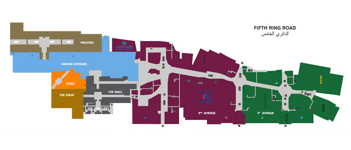
The layout of The Avenues, Kuwait. - Owner: Mabanee Company, S.A.K. Associates - Master planning: Gensler. - Located on Sheikh Zayed Bin Sultan Al Nahyan Rd, Al Rai Area, Kuwait City

The layout of The Avenues, Kuwait.
Owner: Mabanee Company, S.A.K. Associates
Master planning: Gensler.
Located on Sheikh Zayed Bin Sultan Al Nahyan Rd, Al Rai Area, Kuwait City

A flagship Mall

2007 saw The Avenues open it’s doors for the first time. The owners of The Avenues have continuously strived to develop and enhance the shopping experience of all consumers in Kuwait to outstanding levels. Levels that the very least equal or in many occurrences surpass the shopping experiences enjoyed in Europe or America. The owners’ ambitions for The Avenues are enormous, it is planned to be the 3rd largest mall in the world when finished. These ambitions truly reflect the region’s general optimism and confidence.

The Avenues has set a new benchmark and raised standards throughout the industry, particularly in the Middle East. It truly is a world class shopping and entertainment destination. At the moment, The Avenues is one of the largest malls in the world (14th) and houses more than 800 stores spread over the 7 districts.

To me The Avenues is a wonderful achievement. Built in the scorching desert and at a truly enormous cost, in a country with a small population, it shows the determination of the Kuwaitis in particular and the Arab world in general to invest in their own economies, in their own populations. More than 500,000 people a week take the time to enjoy the mall.

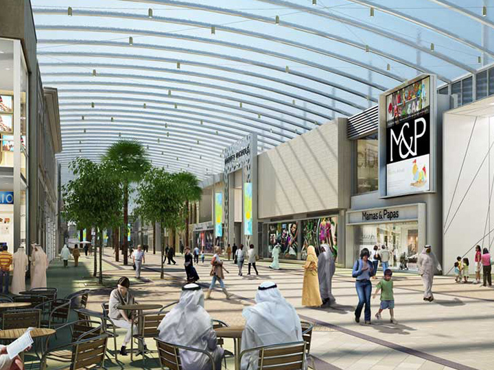
Visual for The Avenues, Kuwait showing the cafés, glazed roof and retail stores

Visual for The Avenues, Kuwait showing the cafés, glazed roof and retail stores

1st Avenue

The Avenues Concept was inspired by the natural forms of the desert sand dune, rock formation and the sky. It was designed to attract renowned international brands that could not be found in the region at the time. It was to have spacious mall areas where consumers could relax, meet with family and friends, have something to eat and enjoy the shopping.

It features over 200 stores, restaurants and cafes, some wonderful perfume houses, 11 screens at the massive Cinescape with the wonderful VIP Cinema area.

The home furnishing zone includes international stores, such as Ikea and Pottery Barn, The White Company along with Zara Home with some of these brands making their debuts in Kuwait.

2nd Avenue

The glass roof is made to allow the sunlight to flood into the internal area which gives the feel of an outdoor space. International designer brands are found here including Mont Blanc and Dupont. The area contains over 200 stores and a wide variety of restaurants and cafes, lots of family entertainment and great play areas for the kids.

There is a Carrefour hypermarket which is the first Carrefour in Kuwait and which is extremely popular with Kuwaitis. Here you find a designated specialty Kids’ zone which contains clothing stores aimed at children and includes several internationally famous high-end designer brands such as Guess Kids, Ralph Lauren Kids, Petit Bateau, Dolce & Gabbana Kids and good old Mothercare. For relaxation-seekers, the 2nd Avenue also houses two top tier Spas.

Prestige Mall

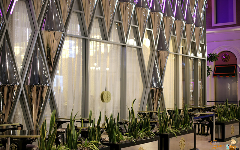
The Prestige Mall is Kuwait’s largest luxury shopping destination by a very long way, it contains all the high-end brands you could ever want, as well as fabulous cafes and restaurants that serve the finest international cuisine. The Italian designer, Roberto Cavalli opened a beautiful restaurant, clad entirely in jewel-like, mirrored and polished stainless steel panels by Double Stone Steel.

Polished aluminium cones forming the Roberto Cavalli Caffé exterior, The Avenues, Kuwait - Architects: In-house Roberto Cavalli.<br />Façade: Double Stone Steel

Polished aluminium cones forming the Roberto Cavalli Caffé exterior, The Avenues, Kuwait
Architects: In-house Roberto Cavalli.
Façade: Double Stone Steel

A famous meeting point

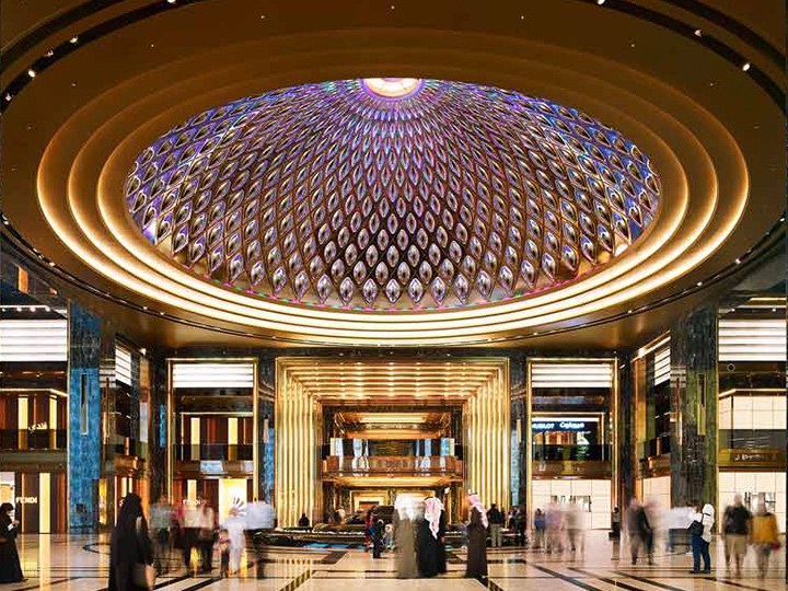
The Prestige Mall has an outstanding 23 meter high x 46 meter diameter stainless steel dome. The dome features PVD coated stainless steel by Double Stone Steel. The dome has its own lighting system and has become extremely popular with locals and tourists. If you want to meet someone at The Avenues, you meet them under the dome.

The colored stainless steel dome, The Prestige Mall, The Avenues, Kuwait. PVD stainless steel by Double Stone Steel.

The colored stainless steel dome, The Prestige Mall, The Avenues, Kuwait. PVD stainless steel by Double Stone Steel.

Photo: Alghanim International General Trading & Contracting Company

This beautiful dome was fabricated to enhance and reflect the luxurious feel of the outstanding brands in the Prestige Mall, these brands include such households names as Harvey Nichols in Kuwait, Chanel, Burberry, PRADA, Louis Vuitton and Christian Dior, Berluti and Armani.

The unique stainless steel architectural arches that frame all the stores, utilise copper colored, PVD coated stainless steel elements fabricated by Double Stone Steel that are beautifully complemented by the ‘Portoro’ stone, which was selected and cut then imported from the mountains of Italy. The Prestige Mall embraces the largest quantity of this exclusive, luxury stone to be used in a public are anywhere in the world. This material is usually found in palaces, stunning is the only word.

Grand Avenue

Walking down the tree-lined Grand Avenue is much like walking down a grand shopping boulevard in the centre of Europe. The Architecture of the retail facades features three styles – European, local and contemporary. The Grand Avenue Boulevard is covered with a transparent roof structure that reinforces and enhances the feeling of being outdoors. The Boulevard is over 500 meters in length and approximately 22 meters wide. It is a great place to take part in mall-walking. The materials used in the construction of the Grand Avenue are versatile and include Portland Stone, brick (imported from the United Kingdom), ceramics, mosaics, stainless steel and timber.

The streets are paved with natural stone from various different countries of the world – Turkey, Spain, China and Italy. The floor gives architectural character to the district. Includes the “Galleria” zone, which houses a number of fine dining and international restaurants.

The Grand Avenue, The Avenues, Kuwait

The Grand Avenue, The Avenues, Kuwait

The Mall

This is a two-floor extension to the present shopping experience, holding a variety of recognised brands. It offers a classic mall environment of an architectural style that is contemporary and modern. Includes courtyard plaza that has cafes and restaurants, which enhance the lively atmosphere of the district. The district includes the “The Jewellery”, where the design and color of the retail façades reflect the high value of the goods on sale inside.

It features a beautiful fountain, which allows visitors to enjoy the seating around it. KidZania is located on the first floor, above the “The Jewellery”, and is an entertainment centre that provides children and their parents a safe and unique educational environment that covers an area exceeding 5,000 sq.m.

SoKu

Influenced by New York’s bohemian Soho district, SoKu is an acronym for the South of Kuwait. SoKu offers an iconic urban shopping experience that was designed to attract Kuwait’s youth, and the district is perfectly poised to house leading brands. These include the Ferrari Store (well it is Kuwait) and Tommy Hilfiger.

Soku’s edgy, urban architecture provides a “street savvy” appeal and a cultural environment that encapsulates everything in up to the minute retailing.Tree shaded courtyards provide focal meeting spaces, strategically positioned to further animate the space. A specialised zone for sportswear and equipment is located on the first floor, housing the best sports brands such as, Nike, Adidas, Reebok, and Soccer Scene.

The Souk

Modelled to mirror a traditional Kuwaiti Souk (market), this district is an interpretation of this region’s traditional retail architecture. It features narrow winding streets and really is somewhere you can get lost in. It is a lot of fun and shoppers will find lots of traditional and very unique items.

You can extend your visit to the Souk by spending some time relaxing in one of the wonderful cafes and restaurants that offer the very best Kuwaiti cuisine. The Souk is designed to reflect the active daily lives of Kuwaitis in the past.

The Souk, The Avenues, Kuwait. Designed to recreate the traditional shopping souks of Kuwait.

The Souk, The Avenues, Kuwait. Designed to recreate the traditional shopping souks of Kuwait.

Balance and Proportion

Alvaro Siza’s Swimming Pools in Leça da Palmeira are more than just Swimming Pools. The set’s composition emerges from the program’s articulation and the site’s constraints. The small distance between the avenue and the sea foresees an elongated building, following the strong score line of marginal wall. But little is seen from there.

Approach to Swimming pool by Alvaro Siza, Leça da Palmeira, Portugal.

Approach to Swimming pool by Alvaro Siza, Leça da Palmeira, Portugal.

Photography by Ana Lopes Ramos

The program aims towards a strict relation between body and architecture. It’s an intimate contact, as if the architecture was an extension of the body. The proportions, the domesticity give us this idea of body trace, of an architecture for the Man.

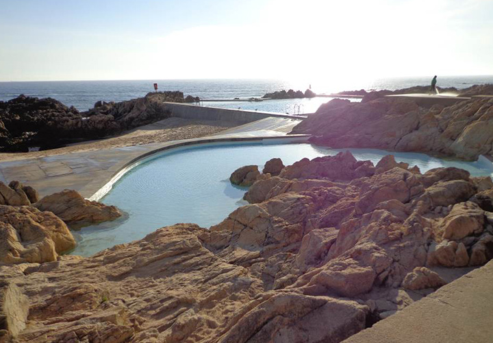
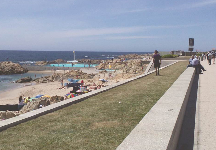
The concrete building that blends with the rocks’ colors mitigates the contrast between built and natural. Also its location, between the beach and the avenue’s elevations, places the roof on our eyes’ level, maintaining constant visual permeability between the avenue and the horizon, allowing a tender transition between the urban and natural, and making difficult the distinction between both. We see the main pool far ahead, in the middle of this rocky beach, and we easily mistake it with the sea.

The beach and the avenue approaching the Swimming pool by Alvaro Siza, Leça da Palmeira, Portugal.

The beach and the avenue approaching the Swimming pool by Alvaro Siza, Leça da Palmeira, Portugal.

Photography by Ana Lopes Ramos

The approach to the pool

The relationship with the pool is not immediate. There is a preparation and gradual approach that is given by the concrete walls that lead us through ramps and platforms in a downward path, passing by the bathhouses and beach until we finally reach the swimming pools. The project acquires a longitudinal extension where the notion of time is also distorted, that is: instead of heading to the pool in a short straight line from the marginal, we are driven towards the complex that leads us through an extended path.

As the lived space is different from the geometric space, the time spent is different from the real time and that is what gives us the experience. This increase in distance and, hence, increase in time also corresponds to a progressive isolation of the city, stirring and functioning as a noise filter in order for us to absorb this change of surroundings. Álvaro Siza draws a time to arrive.

Entry point to Swimming pool by Alvaro Siza, Leça da Palmeira, Portugal.

Entry point to Swimming pool by Alvaro Siza, Leça da Palmeira, Portugal.

Photography by Ana Lopes Ramos

The elementarity of the construction draws an analogy with the picturesque ideals of the nineteenth century, where the idea of the center in motion, of no direct arrival is considered. This architecture where the body is in constant motion is conceivable from subtracting cores of possible life. Meaning, there are no living spaces. The program itself, elongated design, and plans suggest movement. It is the design of the path that solves the whole project.

The blend of concrete with rocks at the Swimming pool by Alvaro Siza, Leça da Palmeira, Portugal.

The blend of concrete with rocks at the Swimming pool by Alvaro Siza, Leça da Palmeira, Portugal.

Photography by Ana Lopes Ramos

Intriguing wayfinding

More than lead the visitor, this route interacts, it is dynamic, and it questions us. It is interesting to think that our body and mind need this, this push that encourages us to discover and to follow a certain path. As we move forward, the following reference confirms us the earlier and, consequently, motivates us to achieve the following.

After descending the access ramp, we see a small counter. Behind, two black wooden doors with a low right-foot [two meters] and a thick concrete roof [one meter]. This access area to the spas is dark; it seems to us a restricted area, forbidden maybe. Here the sense of limit is ensured although there is not a physical boundary that marks the entrance. There is no typical traditional Portuguese threshold or a similarity with Siza’s previous project Casa de Chá where there is a clear distinction between interior and exterior. Also, there is no typical door handle, nor jamb. There is instead a continuity between exterior and interior that is, in a way, barred by the screen that works here as a border. But this limit can also be perceived as the beginning of something new instead of a restraining element, the door that closes is precisely the one that can be opened.

Access to Swimming pool by Alvaro Siza, Leça da Palmeira, Portugal.

Access to Swimming pool by Alvaro Siza, Leça da Palmeira, Portugal.

Photography by Ana Lopes Ramos

Next to it, the area of access to the bar/lounge appears to us more inviting. Perhaps because employees leave the three-meter door open, urging us to make the entry there. As it is an uncovered space, this route, visibly outside, is exposed, illuminated, is public, and gives us confirmation that we can move in that direction. Both paths eventually lead us to the pool although we are quickly encouraged to make our entrance through this last than to go through the low, dark, and cold baths.

The mysterious door – Swimming pool by Alvaro Siza, Leça da Palmeira, Portugal.

The mysterious door – Swimming pool by Alvaro Siza, Leça da Palmeira, Portugal.

Photography by Ana Lopes Ramos

So we stop; we take the time we need to reflect our way. Then our adventure begins.

Cantilevered colors

The pure and most thoughtful minds are those which love color the most. – John Ruskin, The Stones of Venice, 1853, Volume II, Chapter V, Section 30.

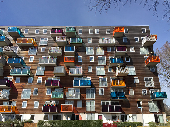
The first time I heard about the Wozoco Apartments was during my University studies. I remember thinking that the splash of color in the façade was a refreshing and creative approach towards architecture. The various window sizes and the façade elements arranged in a seemingly disorder play along with this young experimentalist methodology.

MVRDV’s choice regarding the materials also caught my attention; horizontal wooden boards wrapping most of the building – a material that ages with time – and coming out of the building, these colorful blocks made out of acrylic panels – a material well known for its aging resistance, a clash that results in a rich and interesting balance between old and new.

Wozoco Apartments, Amsterdam. The colorful Façade.

Wozoco Apartments, Amsterdam. The colorful Façade.

Photography by Ana Lopes Ramos

Same footprint, more apartments

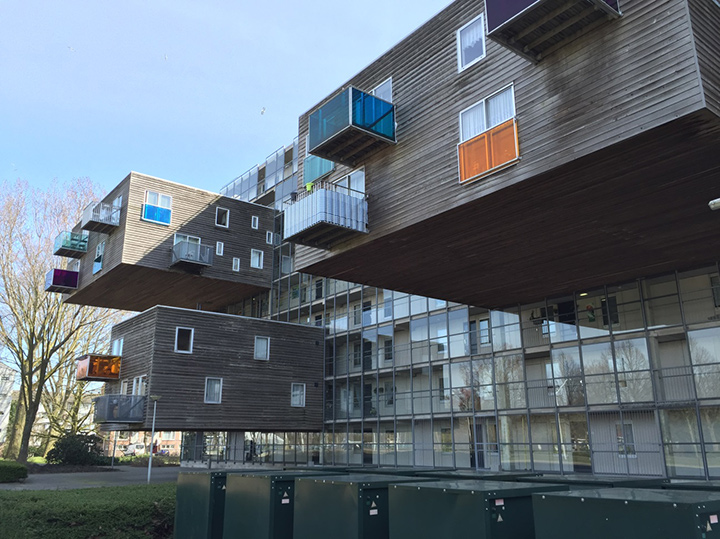
Soon I realized the project was more than just an interesting colored façade. It started with the program that sought for 100 apartment units in a plot where only 87 met the required daylight zoning regulations – the higher the building, the less sun for the surrounding buildings; the bigger the footprint, the less green and public space – so where to build? With no place to grow up nor sides, MVRDV came up with the idea of cantilevering the remaining 13 units.

The best place to hang the units was in the north façade, avoiding direct sunlight therefore avoiding shadowing the other apartments. These units burst from a gallery made of glass [a corridor that allows the residents to access their apartments]. The big scale of the blocks suspended in such a fragile material makes us wonder how the architects managed to cantilever them. They look lightweight, levitating in thin air; immediately our common knowledge of weight and gravity is putting this into perspective. The massive hidden structure in the core building is what keeps them from falling, a decision that brought up additional costs in the project, leading to some budget amendments.

Wozoco Apartments, Amsterdam. Units defying gravity.

Wozoco Apartments, Amsterdam. Units defying gravity.

Photography by Ana Lopes Ramos

After solving the program, these adjustments were crucial to the building’s design. The flats are organized in a very resourceful way. For sound insulation purposes, the partition walls were thickened up to 80mm, which enabled extra width to expand and reinforce the structure supporting the cantilevered blocks allowing the weight of the structural walls to remain the same. The costs of the materials were also adjusted; the facades and blocks were made of wood, acrylic and glass within a curtain wall system. The finishes were made roughly; the joints and some other details were exposed, offering an unfinished industrial look.

Denoting the entrance

The entrance was placed at the west side of the building; a block sticking out from the façade continues the core building’s pattern with two rows of five columns sustaining it, creating a double-height covered area. These elements of exception are commonly associated as main entrance features, a transition between exterior and interior. A glazed antechamber gives the inhabitants access to the building and their apartments. A steel gridded frame assembles the see-through wall contouring and blending with the North façade, encouraging the building to become a unity, a whole.

The ingenious approach gave MVRDV some awards including the Best Integrated Structure in a Building, being also pointed as one of the buildings constructed with the lowest costs in Amsterdam. An original and creative project that will always be known for its young and playful form, for bringing color and some joy into the real world of architecture.

The Hospice Gantois

The Hospice Gantois was founded in 1462 by Jean de la Cambe a rich merchant and alderman who earned his fortune trading alabaster with England. This is one of the much loved city landmarks in typical Flemish renaissance style dating back to Lille’s golden era. The hospice was originally built to treat the sick and the elderly and remained a hospital for over five hundred years right up until 1995. After almost twenty years of neglect this listed building in brick and stone was sold to a property developer who was willing to renovate the building entirely and turn it into a luxury five-star hotel. MAES are a local architectural practice specialized in urban regeneration projects. They were in charge of this sensitive renovation project under the supervision of the state architect in charge of historic buildings.

The Hospice Gantois in 1966

The Hospice Gantois in 1966

From hospital to hotel

The hospice is made up of several adjoining blocks of houses together with a very striking main façade giving onto the rue de Paris. At one end of the building are three typical gabled houses linked to the main hospice building. The main building is organised around a magnificent gothic gable in local limestone with a central arched stained glass window. This used to be the main hall for the patients of the hospice with a superb vaulted ceiling and tiled walls and floors. Today this has become one of the hotel’s main conference venue.

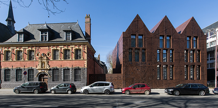
Hermitage Gantois. The façade of the original building and the new façade of the Spa which was created on the same model as the three gabled houses at the other end of the building

Hermitage Gantois. The façade of the original building and the new façade of the Spa which was created on the same model as the three gabled houses at the other end of the building

Behind the main façade extends a series of buildings organized around four indoor courtyards including a beautiful cloister which add up together to a net surface area of over 5 800 m². The renovation project kicked off in 2001 and was completed in 2003. To create the main atrium and hotel lobby, the architects have covered one of the indoor courtyard nearest to the main entrance with a huge glazed canopy that rests on a tall fine steel structure. To separate the main atrium from an adjoining small patio the architects have created a glazed partition wall that runs across the north west side of the lobby. This creates a bright and airy atmosphere in the lobby area with an open bar positioned in the centre. The lighting system has been housed in smaller L shaped steel masts that blend into the overall structure. Apart from the main lobby the hotel boasts eight different halls and meeting rooms to host events and seminars, 65 luxury rooms & suites together with a restaurant and a brasserie.

The lobby of the Hermitage Gantois within the atrium. By MAES Architects

The lobby of the Hermitage Gantois within the atrium. By MAES Architects

A Spa Extension

The Hermitage Gantois hotel quickly developed its high-standing reputation so that in 2012 the owners commissioned again MAES architects to design a new extension which would house a spa as well as an indoor swimming pool together with 17 extra rooms. To meet the challenge of grafting a new extension to a listed building MAES developed their design intentions around the three gabled houses at the other end of the building so as to create a mirror effect. But the distinctively modern aspect of the new extension is created by an external cladding in powder coated aluminium to give it the bronze aspect of rusty steel.

Façade of the Hermitage Gantois Spa. This appears to be rusty steel but is in fact powder-coated aluminium

Façade of the Hermitage Gantois Spa. This appears to be rusty steel but is in fact powder-coated aluminium

A very modern exterior

This external cladding covers the whole surface of the new extension including the roofing. It is made up of hundreds of panel sections fixed on an aluminium and steel structure. Each panel box incorporates the external insulation (160 mm of Rockwool). This unifies the aspect of the three steeply gabled buildings: the irregular patterns of the perforations spattered across the smooth surface of the aluminium sheets creates a play on light and shadow which changes according to the different hours of the day and night. A grid of horizontal and diagonal ridges creates another dynamic element. The tall narrow window openings are recessed to create further volume and depth. The reflective glass makes them stand out in the daytime against the matt aspect of the external cladding. At the base of the building on the left hand side, a series of perforated panels discreetly hides a glazed pedestrian walkway that links the new hotel extension to the main building. All in all, this modern extension blends in remarkably well with the existing listed buildings.

The new façade of the gabled spa extension adjacent to Hermitage Gantois. The perforations make the facade twinkle at night when the building is lit up from within

The new façade of the gabled spa extension adjacent to Hermitage Gantois. The perforations make the facade twinkle at night when the building is lit up from within.

Kitchen’s Physics (Titanium spaghetti)

If you cook from time to time or, if you observe somebody else to cook for you at least, while the fragrance of the ingredients enhances your expectations, the experience can have two surprising results: one is that you will probably get hungry and starve perhaps if you observe for too long… The other one is that you may have a chance to understand some basics of Physics and Chemistry.

While you are boiling spaghetti, for example, as you have surely observed already, all the inside of the saucepan becomes covered by water vapour mixed, probably, with spaghetti’s particles.

After about 8 minutes (no longer if you want them cooked “al dente”), when you drain the pasta in the colander, you can notice that the internal surface of the saucepan is entirely covered by water vapour and by some spaghetti’s particles: the vapour will then become liquid and vanish quite quickly since, at the normal temperature of the kitchen, water tends the return to its liquid state.

Imagine that your hob is so powerful that you can melt in the saucepan a piece of Titanium and make it to evaporate: the Titanium’s vapour would then reach the internal surfaces of the saucepan and will stick to it as water vapour does.

The thin layer of Titanium’s vapour would become solid very quickly because of its very high melting temperature and you will never be able to clean up your saucepan anymore… This is how I understood thermal PVD coating… spaghetti is a different matter, much more complicated!
A solid titanium sputtering target by Plansee.

A solid titanium sputtering target by Plansee.

PVD basics (Physical Vapour Deposition)

PVD It is a process based on the strategy of to vaporize a substance (target) and to facilitate the deposition of the vapours (through a vacuum or plasma environment) onto another material (substrate). The gradual and even deposition of the vapour is to to create a solid thin film on the substrate.

It is a quite efficient method of coating which has some great advantages if compared with other more traditional systems:

Almost any inorganic material can be made to vaporize and to deposit.

There is no dispersion of gasses therefore it is more sustainable than other methods.

The coating achieved in this way is incredibly hard and durable.

There are many different types of PVD techniques but the process can always be simplified in three basic steps:

1. Vaporisation of the target (metal usually but not always),

2. Transition of the particles toward the object to be coated and

3. Deposition of the particles on the substrate to be coated.

To achieve the first step (evaporation) there is always need of some source of energy to stimulate the target strongly enough to make its particles to detach and leave.

To make the process happening in a vacuum environment allows the particles to navigate much more easily toward the substrate and to keep out all the impurities. It is possible to introduce plasma as vehicle for the transition.

There are two big families and an half of PVD process: Thermal evaporation, Sputtering and Ion Plating but many other techniques are available.

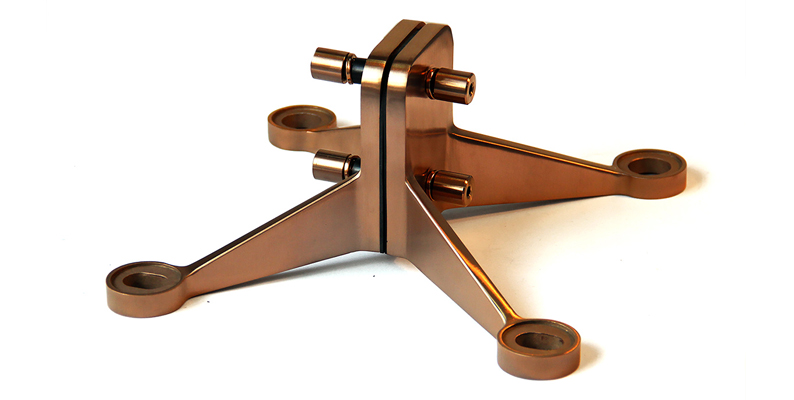
Spider bracket component for glazed roof as part of the Wandsworth footbridge construction by John Desmond Ltd, UK & Europe partner to Double Stone Steel

Spider bracket component for glazed roof as part of the Wandsworth footbridge construction by John Desmond Ltd, UK & Europe partner to Double Stone Steel

Thermal Evaporation

The temperature of the target has to be raised, as we said, to make it to melt and to emit vapours. This can happen for example using and electric resistance to produce heat. In the vacuum the vapours will then travel and hit easily the substrate to be coated.

This method allows keeping a very high level of “purity” and it is therefore suitable to coat high tech components: as an example the production of semi-conductor junction in micro diodes used in electronics.
There are disadvantages that can direct the choice toward other methods:

The surface to be coated needs to have a higher melting temperature than the coating metal and this limits the choice and make more complicated to mix the components.

A very high level of energy is required to eat up to the melting point the target.

The stream of the navigating particles is strictly directional and this makes it very complicated to coat evenly steps and irregularities on a non-planar object.

Spider bracket in Black is Black PVD colored stainless steel.

Stainless steel spider bracket shown in PVD coating Black is Black.

Stainless steel spider bracket shown in PVD coating Black is Black.

Sputtering

Well… I looked and observed carefully in the kitchen but… I couldn’t find any useful comparison for this one: please tell me if you can help! In the meanwhile I step out of the kitchen.

In this case in order to convince the particles of the target to leave its surface, the material has to be hit strongly enough by plasma’s high pressure beam (commonly argon ions).

Under the pressure of the ions stream the atoms will start to leave the surface of the target and will jump randomly in the vacuum room depositing also on the substrate.

Here a few advantages of this method if compared with thermal evaporation:

The particles jump in every direction therefore it is easier to coat evenly steps and irregularities.

The target doesn’t have to be melt therefore you don’t have to worry of not to melt the object to be coated.

The method is quite slow but can be enhanced (enhanced sputtering) with the introduction of a low voltage arc discharge at the centre of the vacuum chamber, which makes the transition of the material from the source to the substrate much quicker.

A few common objects which are often treated with sputtering: CD and DVD, scissors, cutlery, cutting tools, mirrors, glass coating.

Ordinary stainless steel spoons coated with PVD in Royal Gold and Black is Black. By Double Stone Steel.

Ordinary stainless steel spoons coated with PVD in Royal Gold and Black is Black. By Double Stone Steel.

Ion Plating

No way can I find Ion Plating near my kitchen right now but I’ll ask to my wife: she may know!

This method could be explained as a mix of the two previous ones.

The target has to be either brought to its melting temperature or hit by plasma, so that the particles start to detach from its surface and travel toward the substrate, assisted by vacuum or plasma.

The substrate has to be prepared by sputtering cleaning which means to use the process explained above but only to prepare the surface to receive the coating particles, and this can by shooting a stream of ions of the target material on the substrate.

Titanium nitride (TiN) is an extremely hard ceramic material which can typically be applied by Ion plating and it offers an incredibly good resistance on cutting tools or medical implants, and it has now a much wider field of application from jewellery to architectural finishes.

The many uses of PVD:

PVD coating enhances the durability of objects, the scratch resistance, the impact strength, the abrasion and corrosion resistance, the weather resistance, the overall durability of the object and it is used in many fields of the production.

A complete list or products would be surprisingly long but I would like to mention a few to give you a rough idea:

  • Jewellery and watches.
  • Machine tools (ex. drill bits and milling cutters) and common utensils (scissors, cutlery, screwdrivers).
  • Medical or surgical devices (scalpels blades etc..) and prostheses.
  • Bicycles and motorcycles parts (ex. Pistons or other parts which were once chrome plated).
  • Microelectronics components (semiconductor devices), mobile phones, cameras.
  • Aluminized PET film on snack bags.

PVD is becoming more and more diffused in the fields of industrial design, furniture design and interior design: doors ironmongery, kitchen units, plumbing, taps, sheet metal finishes in general (kick plates, skirting, wall finishes).

PVD coated stainless steel can be used as cladding material on the envelope of buildings and depending on the material you decide to deposit on the substrate, you will obtain different qualities booth physical and aesthetical.

I would say, using a notorious slogan: PVD coating, from the spoon to the city!

PVD colored stainless steel in Bronze brush finish by Double Stone Steel
PVD colored stainless steel in Bronze brush finish by Double Stone Steel

First impressions

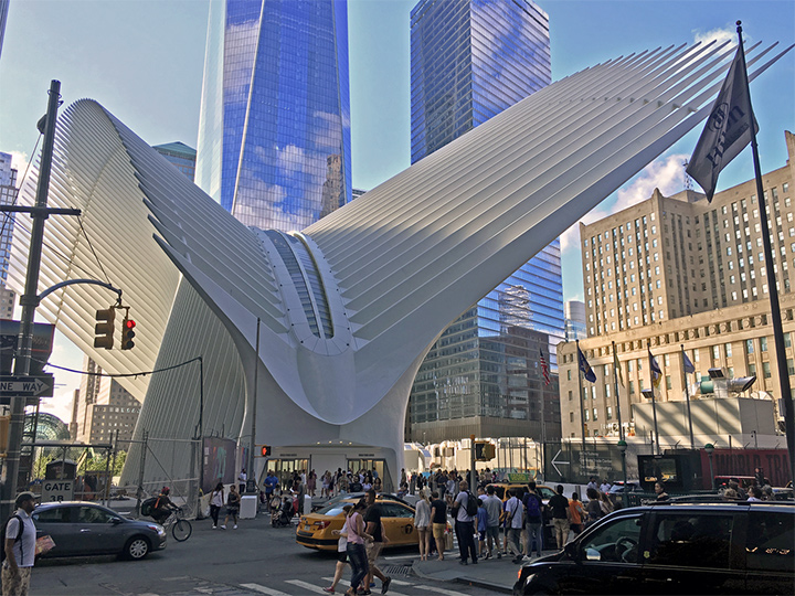
Approaching the new World Trade Center Transportation Hub in lower Manhattan, designed by Santiago Calatrava, is like approaching the bones of an ancient, beached whale. The great, white Moby Dick of literature, perhaps? Or, is it more like a piece of optical art? Looking west along Fulton Street, a dense swarm of parallel, slender, fossilised fingers cantilever angularly overhead, as if waiting to take flight. As one makes one’s way along Fulton Street towards the former site of the World Trade Center’s twin towers, an undulating, striated wall of white shimmers with parallactic shifts. Drawing closer, the image of cantilevered fingers yield to that of a skeletal carapace or the remains of a great, fantastic organism.

The Hub, built on the site of the World Trade Center, New York and designed by Santiago Calatrava

The Hub, built on the site of the World Trade Center, New York and designed by Santiago Calatrava

The location of the Hub

The Transportation Hub sits in a great clearing within the dense urban fabric of lower Manhattan. New York City was born here – as New Amsterdam in the seventeenth century – and it is home to the Financial District and Wall Street. It is one of Manhattan’s most densely populated areas by day, and one of its least densely populated by night. It is also where the World Trade Center collapsed in 2001, an event which in addition to reshaping geopolitics and world travel, has profoundly reshaped the neighbourhood. The Transportation Hub is a key component of Daniel Libeskind’s master plan for the rebuilding of the area. It sits between the vast open space and sunken pools of the 9/11 Memorial, and the thicket of office towers east of Church Street. Although the World Trade Center required breathing space for each of its two hundred-storey towers, one cannot help but feel that the resulting open space left in its wake feels oddly out of place within the context of Manhattan Island, like the centre of a vast donut.

WTC Building Arrangement and Site Plan. - Planned arrangement of World Trade Center buildings following the rebuild after the September 11 attacks. The greyblue squares are the positions of the previous towers. “WFC” means World Financial Center

WTC Building Arrangement and Site Plan. – Planned arrangement of World Trade Center buildings following the rebuild after the September 11 attacks. The greyblue squares are the positions of the previous towers. “WFC” means World Financial Center

The Hub’s dynamic

Approaching the Transportation Hub from Fulton Street Station, one cannot help but compare the two stations. Fulton Street itself services eight New York City Subway lines, and is among the busiest stations in Manhattan. While both feature an oculus as a focal point, the differences between them could not be more stark. Fulton Street is decidedly urban, hugging the corner of Fulton Street and Broadway within a trim footprint and glass and steel facade, seamlessly disappearing into the fabric of the city. The primary challenge at Fulton Street is one of light, and Grimshaw in consultation with James Carpenter, conceived an oversized skylight and network of mirrors as a means of bringing daylight into the depths of the station; its oculus rises five storeys above ground and reaches two floors below. Durably clad in functional stainless steel, the station itself is arranged around the oculus vertically, with a ring of shops hovering above the ground floor, and the main transit concourse below to allow views up from the transit floor to the sky, and down from the retail levels to the transit floor. The result is something that feels like a process of excavation, carving out space larger than its site in lower Manhattan would allow; it is, in this way, a microcosm of Manhattan itself. The Transportation Hub, on the other hand, reaches out to claim space around it. Its curvaceous plan tapers at its ends, creating outdoor space at Church and Fulton Streets and again on Greenwich Street opposite the 9/11 Memorial, and bulges in the middle to contain commuters. Like eyebrows, its cantilevered fingers of steel reach out dramatically across Fulton Street to the north and Dey Street to the south to claim urban space and draw it in.

The Transportation Hub by Santiago Calatrava

The Transportation Hub by Santiago Calatrava

Photography by Antony-22 at Wikimedia Commons

Past, present and future

The Hub opened whilst still largely unfinished; it opened to the public but remained a construction site, with completion not made until some time later in 2016. The building is designed to connect two rail lines operated by the Port Authority Trans-Hudson with seven New York City Subway lines, and is intended to serve a projected 250 000 commuters daily, concentrated at the rush hours. The building is scaled accordingly, with a main space 110 metres in length accessed by tall, broad corridors which are themselves flanked by 7500 square metres of retail space (also under construction). One has to imagine the throngs of people that will use this transit station every morning and evening as they migrate to and from lower Manhattan. One has to imagine the now empty shopping concourse as a hive of activity. One has to imagine the hustle of the city being funnelled through the building, and being carried along by a rushing current of commuters through subterranean connection to office buildings and to Fulton Street Station. At the time of my visit, however, the building is an oddity: its necessary spaciousness met by an eerie emptiness.

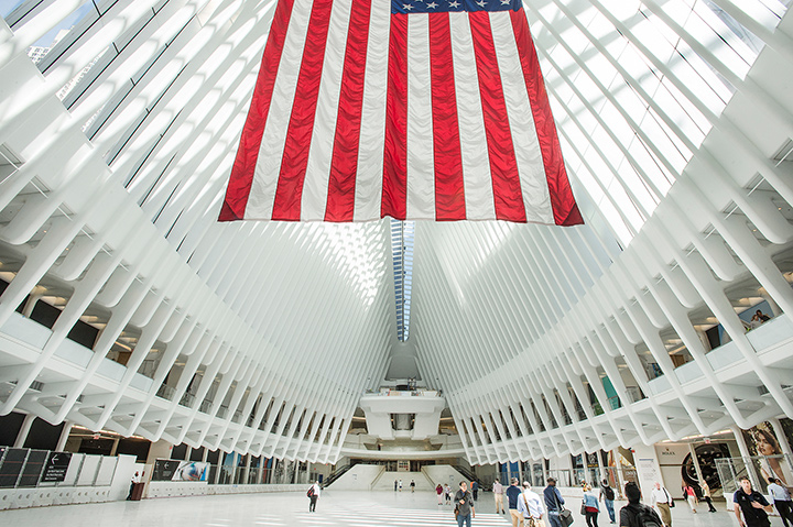
While it was under construction, one entered the Transportation Hub via the lobby of an office building at the corner of Liberty and Church Streets. Descending the escalator, one enters a vast, white world of expansive marble-clad walls and a floating white ceiling held atop the smooth ribs of a colossal structural skeleton. For a building that from the its extroverted, cantilevered exterior, would seem to be the pinnacle of structural expressionism, inside, the Transportation Hub’s detailing is simultaneously dematerialising.

Calatrava’s organic design

The palette is restrained: white painted steel and trim, white marble, glass, brushed stainless steel. Mechanical fasteners have been carefully hidden, and rather than being angular, the structural steel has been softened by grinding and painting, creating an organic smoothness of beam becoming column, as if the building has been grown rather than constructed.

The restrained, softened interior is also noted by Julie Iovine for The Wall Street Journal. (Julie V. Iovine, “The New World Trade Center Transportation Hub Puts Dazzle over Details,” The Wall Street Journal 2016)

Similarly, surfaces and joints have a relative absence of articulation, with minimal reveals at the junctures of wall and structural skeleton that further heighten the sense of dematerialised lightness. While the use of marble gives the building a sense of monumentality and permanence shared by few other transportation buildings in New York’s network, the tight, segmented spacing of structural beams brings the parallactic effect of motion of the exterior indoors. The overall effect is one of gentle, serene, misty light, as if one is looking into the haze of an optical ganzfeld. Rather than the sterility of a hospital, it is as if one is walking into the mysterious depths of a foggy landscape as the building seems to move as one circulates through it (at least until it is populated by a shopping mall when it opens to the public).

Along these lines, Paul Goldberger recently argued for the Transportation Center as a space of urban theatre in Vanity Fair ( Paul Goldberger, “Beyond the Hype, Santiago Calatrava’s $4 Billion Transportation Hub Is a Genuine People’s Cathedral,” Vanity Fair [2016])

Despite the tight spacing and significant dimensions of the steel, the overall effect is one of durable gracefulness, strong lithefulness, and weighty lightness in which the building functions without appearing to do so. It this sense of gravity-defying heft, as with other projects by Calatrava’s office, the result is neo-Gothic in aspiration and impact.

The Oculus

After meandering down the vast corridor, one enters the building’s centrepiece. Nowhere is this Gothic aspiration of the building more evident than in the Oculus. Overhead, two arches rise up to more than fifty metres above the floor, held apart to give an opportunity for a sliver of the sky to be brought indoors through a linear skylight over one hundred metres in length. It also allows the outdoor air in, for the skylight itself is fully operable, providing natural ventilation. Against these arches lean the linear sequence of v-shaped steel ribs that create the outward image of the building. Through the glazed spacing of these ribs, one glimpses the office buildings beyond, as the inclined walls of the Oculus become a canvas on which to view the spectacle of the city. The spectacular, luxurious volume offered to the erstwhile cramped commuter is altogether extraordinary in the context of New York City. It is a space to not only accommodate the masses, but offer them relief and delight from daily stresses; in such a vast, bright and airy space, there is a fleeting escape from the worries of the day, and a moment of levity. This is true despite the symbolic value of the Oculus: in clear conditions, at 10:28 every 11 September it will frame the sun, casting a sliver of light across the site.

Mostly, though, the Oculus is a space for contemplating the sky. In a city where the streets are canyons, the sky is largely absent. However, in New York’s streets the sky becomes a line framed by street walls stretching overhead. Through the aspect ratio of the skylight, Calatrava brings a particularly Manhattan experience of the sky indoors and down-to-earth.

In a city where transportation buildings are dimensionally cramped, maintenance-challenged and functionally prosaic rather than poetically aspirational, the Transportation Hub offers something else entirely: space, air, monument, generosity.

Calatrava’s Hub at the WTC. Inside the Oculus, leading to the Dey Street Concourse

Calatrava’s Hub at the WTC. Inside the Oculus, leading to the Dey Street Concourse

Photo: Patrick Cashin / Metropolitan Transportation Authority

Lillian Disney donates $50 million

In 1987, the former Disney pen and ink artist, the very wealthy and generous Lillian Disney, widow of the world-famous Walt Disney, donates $50 million of her fortune to begin construction of the philharmonic hall in Los Angeles. $50 million in today’s money would be around $108 million. A lot of money.

One of Lillian’s many claims to fame is the name ‘Micky Mouse’, Lilian saved the world from the rather depressing and dreary sounding, ‘Mortimer Mouse’ that her husband, Walt had suggested as his preferred name for perhaps the world’s most famous cartoon character.

Lillian and Walt were married for 41 years. Lillian died on 16th December 1997, 31 years later than her husband, aged 98 after suffering a stroke the day before.

The plan for the concert hall was to put Los Angeles at the centre of the cultural sphere on the world stage. Music, which was and is so extremely important to the Disney business, as an art form, was to be honoured very highly with its very own fairy tale castle.

To this day The Disney Concert Hall is the permanent home of the brilliant Los Angeles Philharmonic Orchestra.

The Walt Disney Concert Hall, LA, California. The main auditorium holds 2265 concert-goers and boasts exceptional acoustics. Photography by TIDB (The UK Interior Design Bureau) 2016.

The Walt Disney Concert Hall, LA, California. The main auditorium holds 2265 concert-goers and boasts exceptional acoustics.

Photography by TIDB (The UK Interior Design Bureau) 2016.

Frank Gehry

The architect of the moment was Frank Gehry, but it was no slam-dunk for Mr Gehry. An international competition was held and more that 70 alternative designs were submitted. I have searched for these alternative designs without success.

Gehry imposed his characteristic free form, flowing, sharp edged style on the building and the design team. To me the building represents music made solid. It flows like music; it looks like sound exploding out of the sidewalk like a symphony.

Frank Gehry’s Walt Disney Concert Hall, showing the dramatic structure in contrast to the sidewalk. Photography by TIDB (The UK Interior Design Bureau) 2016.

Frank Gehry’s Walt Disney Concert Hall, showing the dramatic structure in contrast to the sidewalk.

Photography by TIDB (The UK Interior Design Bureau) 2016.

This flowing style, which has made Gehry a household name (well in architect’s houses at least) can be seen in all of his buildings.

The design for the Concert Hall

The design for the Disney concert hall was done years before his signature design for the Guggenheim Museum in Bilbao. The hall was subject to over 10 years of delay and took 16 years to complete, opening on 24th October 2003. This allowed Mr Gehry to hone his design.

On first sight it looks like a set of silver sails heading towards you from Bunker hill. The sails appear to be billowing and full of wind.

The conceptual design originally called for a stone clad building. However, after receiving much critical acclaim for his ground breaking, stunning titanium-clad Guggenheim Museum in Bilbao, Gehry decided to change the stone cladding he had in mind to a 3D stainless steel panel system. Utilizing 3D stainless steel panels, which were designed to be used instead of titanium panels enabled a high gloss finish on the building, rather than the more muted tones of titanium. The stainless steel panels enabled Gehry to develop the design and hone the edges.

The sweeping entrance to the Walt Disney Concert Hall

The sweeping entrance to the Walt Disney Concert Hall

Photo by www.atmtxphoto.com/Blog/Creative-commons

The stainless steel “sails”

This gloss finish has brought its own problems to the design. The surface of the stainless steel panels reflects light and thus heat onto the side walk, making the area uncomfortable for road-users and pedestrians alike. This unusual problem has been partly addressed by metalwork contractors sandblasting the worst affected areas with a fine grit.

The Disney Concert Hall is thought by many to be the first Architectural/Engineering/Construction project in the United States where 100% of all the construction drawings and dimensional controls are defined fully in a three-dimensional computer model. These architectural, structural, mechanical, and construction models consist mainly of very complex curves and complex surfaces.

These early 3D models were generated by a revolutionary computer system, utilising an early 3D modelling system called CATIA CAD/AM on a network of Unix workstations. CATIA was used to produce 3 Dimensional models for Aerospace and the Automobile industry and was very cutting-edge technology.

The stainless steel “sails” of the Walt Disney Concert Hall. Photography by TIDB (The UK Interior Design Bureau) 2016.

The stainless steel “sails” of the Walt Disney Concert Hall.

Photography by TIDB (The UK Interior Design Bureau) 2016.

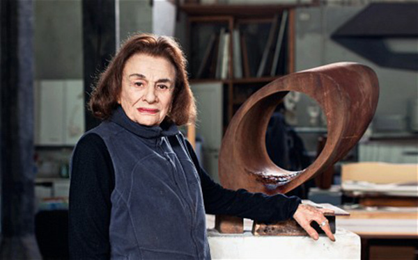
Beverly Pepper with one of her sculptures in her studio near the town of Todi in Italy Photo by Jonathan Frantini

Beverly Pepper with one of her sculptures in her studio near the town of Todi in Italy Photo by Jonathan Frantini

Beverly Pepper’s background

Beverly Pepper is currently one of the world’s most renowned sculptors. Beverly has had an extremely prolific career that spans more than four decades. Beverly was born Beverly Stoll on December 20, 1924 in Brooklyn, NY.

Beverly then attended Madison High School and Pratt Institute where she studied advertising design, photography, and industrial design. Interviewed for and got a great job after graduating, where she earned $16,000 a year as an art director at a major recording company.

Beverly moved to Paris After World War II, Pepper studied art in Paris at the studios supervised by the cubist painters Fernand Léger and André Lhote and sculptor Ossip Zadkine..

In 1956 Beverly’s husband, Bill Pepper became the bureau chief for Newsweek in Rome, actually opening the office there. Beverly moved permanently to Italy, near Rome, although from 1963 on she has worked part of each year in the United States, where most of her works have been exhibited and sold.

Bill sadly died in 2014 at the ripe old age of 96, at their home in Todi, Italy.

Pepper turned from painting to sculpture in 1960 after a trip to the ancient jungle site of Angkor Wat in Cambodia, Beverly was so awed by the temple building ruins surviving beneath the thick jungle growth that she turned to sculpture and rarely picked up her paint brush again.

Artist’s Materials

Pepper first carved in wood, a plentiful and inexpensive material. Instead of hand chisels, she preferred power tools as appropriate to the modern Machine Age. In 1962 the organizer of the music and art festival at Spoleto, Italy, invited ten sculptors to use local steel factories and manufacturers as their studios for a month. Three of the attendees were American, two were well- established masters of abstract metal constructions: Alexander Calder and David Smith. The third was the novice Beverly Pepper, who did not yet even know how to weld. So she apprenticed herself to an ironworker and shortly thereafter made her first steel sculpture, nearly eighteen feet tall. Thereafter, Pepper sculpted only in metal for her large-scale works. Something she still does to this day.

Exodus. 1972. Stainless steel. Beverly Pepper

Exodus. 1972. Stainless steel. Beverly Pepper

Beverly Pepper ‘Perre’s Ventaglio III’, Olympic Sculpture Park, Seattle

Beverly Pepper ‘Perre’s Ventaglio III’, Olympic Sculpture Park, Seattle

My favourites are her stainless steel pieces. Such as Exodus, finished in 1972.

Pepper is also known for her site-specific projects in which she incorporates expanses of industrial metals into the landscape, creating large-scale sculptures, which are frequently designed to function themselves as part of the public spaces they are in.

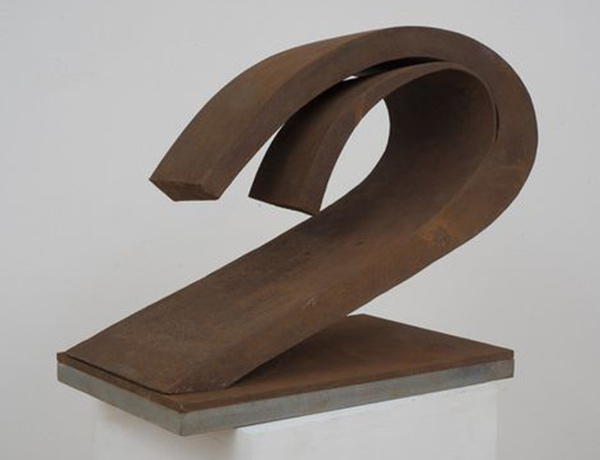
Beverly Pepper. Sbalzo, 2012. Cor-ten steel. 11 1/2 × 13 × 18 in. 29.2 × 33 × 45.7 cm. Edition of 6 Marlborough Gallery

Beverly Pepper. Sbalzo, 2012. Cor-ten steel. 11 1/2 × 13 × 18 in. 29.2 × 33 × 45.7 cm. Edition of 6 Marlborough Gallery

Exhibits and awards

Beverly’s works have been exhibited and collected by major museums and serious art collectors around the world, including The Metropolitan Museum of Art and the Whitney Museum of American Art in New York, the White House Sculpture Garden, the Hirschhorn Museum, and the Smithsonian Institution in Washington, D.C., Les Jardins du Palais Royal in Paris, the Palazzo degli Uffizi in Florence, and numerous other national museums in Europe and Asia.

Chevalier de l’Ordre des arts et des lettres in France, Pepper is a recipient of The Alexander Calder Prize, and with Nancy Holt, the International Sculpture Center’s 2013 Lifetime Achievement in Contemporary Sculpture Award.

Beverly Pepper today lives in Umbria, Italy near the town of Todi.

The life of Rohde

Gilbert Rohde is amongst my very favourite American designers. Rohde, who grew into one of the most influential modernist furniture and interior designers was born on June 1 1894 in New York City.

Gilbert Rohde in 1933

Gilbert Rohde in 1933

Furniture and woodworking and design were in the young Gilbert’s blood; Gilbert’s father was a skilled cabinetmaker who had emigrated to the USA from Prussia.

Rohde, tragically died very early and very suddenly at the age of 50 in June1944, leaving his wife Gladys Vorsanger, whom he married in Paris in 1927, to take over the business, which she ran until it closed in the mid 1950’s. He was eating a cake and reportably his last words were,’ This is the best French pastry I’ve ever had.’ Then the heart attack came and he was gone. Life is fickle.

Rohde also had a successful but brief career as a political cartoonist during the early 1920’s after his graduation.

Influences and philosophy

Although influenced by Bauhaus and Art Deco, Rohde developed a very strong design philosophy. In 1933 he wrote out this philosophy by hand and the part of that simple handwritten document that stays in my mind is as follows.
‘Modern furniture is our expression of the ancient and simple desire to make beautiful and useful things, suited to their purpose and to the tools and materials and tools available.’

Materials

Rohde loved to use and experiment with new and cutting-edge industrial type materials such as aluminium, stainless steel, tube, chrome tube, Bakelite, Plexiglas and the new synthetic fabrics produced by companies such as DuPont. I am sure that Rohde would have fully embraced our PVD process to coat his stainless-steel tubing, clock bodies and beautiful floor lamps

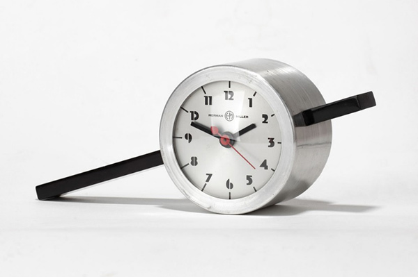
Clock 6351 by Gilbert Rohde for Herman Miller

Clock 6351 by Gilbert Rohde for Herman Miller

The Clock (Clock 6351) above, was designed for Herman Miller and is one of my very favourite examples of a classic Rohde design. The clock is in spun aluminium with a Bakelite bar piercing it. It looks like a pendulum made into a clock.

During 1930 Rohde met with Dirk Jan De Pree the President of Herman Miller and became a vital part of design ethos of the company he also gave advice on production methods and even marketing and sales ideas. Rohde is known as ‘The man who saved Herman Miller.’

Rohde also had close relationships with the Widdicomb Company and the Troy Sunshade Company, where he produced designs for chairs.

Chair designed by Rohde for the Troy Sunshade Company

Chair designed by Rohde for the Troy Sunshade Company

The beautiful chair above was a 1930’s design for the Troy Sunshade Company and is manufactured from Steel Tube, Bakelite and synthetic fabric.

Teaching and other clients

The social programs of the New Deal saw Rohde teaching industrial design at the Design Laboratory from 1936 to 1938 then from 1939 to 1943 he was the Director of Industrial Design Department, School of Architecture, New York University.
Rohde’s long term relationship with the Herman Miller Company was one that certainly help him produce his most important work, However Herman Miller however was not Rohde’s only manufacturing client. He worked with at least 28 other manufacturers across the USA and has truly left his mark on modern American Design.

Desk clock by Gilbert Rohde for Herman Miller

Desk clock by Gilbert Rohde for Herman Miller

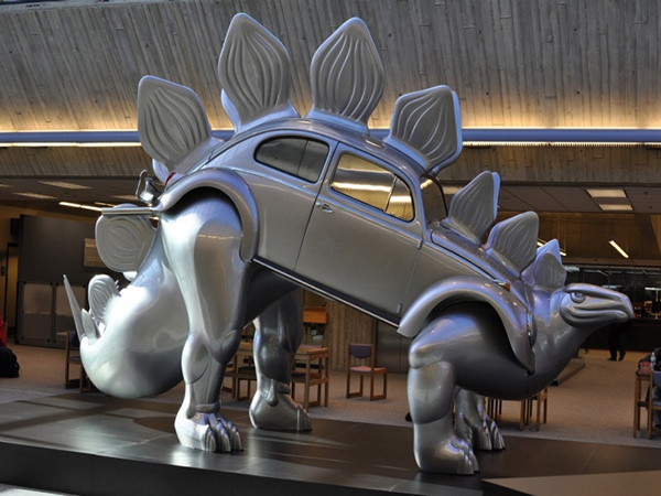
Stegowagenvolkssaurus by Patricia A. Renick, 1974

Stegowagenvolkssaurus, Patricia A. Renick, 1974 in the Steely Library.

Stegowagenvolkssaurus, Patricia A. Renick, 1974 in the Steely Library.

Patricia Renick, was born in Lakeland, Florida, USA, in 1932 and passed away in 2007. Patrica taught then after graduation taught Architecture and Art at the University of Cincinnati, College of Design, for over 3 decades.

As a sculptor, she has internet in repurposing other objects. The piece below is called ‘Stegowagenvolkssaurus’ or by it’s friends ‘Stego’.

Renick said about this piece’“is a commentary on the possible fate of the automobile in a society unwilling to give up some individual freedom of movement in order to conserve energy resources. As a consequence, even the fuel- efficient automobiles of the future may become as obsolete as the Stegosaurus of the past.”

Bull’s Head by Pablo Picasso 1942.

Bull’s Head by Pablo Picasso 1942.

Bull’s Head by Pablo Picasso 1942.

This hugely controversial work by Pablo Picasso was first exhibited in 1944 originally called Bicycle Seat, the pieces was shown at the Salon d’Automne in Paris. The exhibition contained a total of 78 pieces. Parisians did not like Picasso’s new works and Bicycle Seat was removed from the exhibition by public demand.

Eric Gibson, the art critic, described Bull’s Head as being unique amongst Picasso’s body of work for its ‘transparency’. Gibson says the sculpture is ‘a moment of wit and whimsy, both childlike and highly sophisticated in its simplicity, it stands as an assertion of the transforming power of the human imagination at a time when human values were under siege.’

The components of the sculpture were found in a pile of junk,

Picasso said about his creative process, Guess how I made the bull’s head? One day, in a pile of objects all jumbled up together, I found an old bicycle seat right next to a rusty set of handlebars. In a flash, they joined together in my head. The idea of the Bull’s Head came to me before I had a chance to think. All I did was weld them together… [but] if you were only to see the bull’s head and not the bicycle seat and handlebars that form it, the sculpture would lose some of its impact.’

This sculpture is on show at the Musee National Picasso-Paris. It is one of my favourite Picasso sculptures.

Panda Chair 2008 By Belen Hermosa

If you have 4232 old or unwanted compact disks you could either throw them in a landfill or as the Spanish artist Belen Hermosa did, you can repurpose them. I am not sure how comfortable this chair would be but as a work of art, it appeals to me.

Panda Chair 2008 By Belen Hermosa

Panda Chair 2008 By Belen Hermosa

Metal pipe chairs, Piet Hein Eek

Metal pipe chairs, Piet Hein Eek

Metal pipe chairs, Piet Hein Eek

If you are looking for something a little more radical, how about these from Piet Hein eek . The chairs are made from scrap and recycled pipe and are available for purchase at around € 8.251,00.

Maurizio Lamponi Leopardi

Maurizo, was born in Milan, possible the last great centre of european furniture design. In 1968 he graduated as a Building Surveyor. However, thank goodness, he did not find Building Surveying a satisfying career, he gave it up to focus on his art. Maurizo is one of my favourite repurposes he makes beautiful, pieces. You will find many unique lamps such as the photos below at his studio. Not cheap but beautiful. The Light on the left is called ‘Corsa 27’.

“Corsa 27” tablelamp from handle bar in original size, by Maurizio Lamponi Leopardi

“Corsa 27” tablelamp from handle bar in original size, by Maurizio Lamponi Leopardi

“Corsa 27” tablelamp from handle bar in original size, by Maurizio Lamponi Leopardi

Table lamp “Vapor” from an old American steam iron, 2005, by Maurizio Lamponi Leopardi

Table lamp “Vapor” from an old American steam iron, 2005, by Maurizio Lamponi Leopardi

Wim Delvoye

Carved tire from the series ‘Pneu’ by Wim Delvoye

Carved tire from the series ‘Pneu’ by Wim Delvoye

Jamie 2005. Tattooed pigskin on polyester mould. 145 x 74 x 48 cm. By Wim Delvoye

Jamie 2005. Tattooed pigskin on polyester mould. 145 x 74 x 48 cm. By Wim Delvoye

This artist is a Belgian born in 1965 in Wervik and I love his work and ideas. What is more ugly or useless as an object than a used tire? Very little in my opinion. Wim takes these ugly items and transforms them into beautiful works of art.
Wim carves beautifully delicate reliefs into the tire wall, flowers, vines. His goal is to make the viewer think about nature whilst looking at an object that only has an industrial use. He does not use any mechanical tools or equipment to achieve his work. He does it all with hand tools.

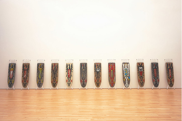
Wim produces very controversial and quite shocking live works of art…How you ask? He tattoos pigs….In China This is a great use of iron boards, way more fun than ironing.

Installation of twelve ironing boards 1990, enamel paint on ironing board by Wim Delvoye. Funf Arbeiten, 1992, Kunsthalle, Nürnberg

Installation of twelve ironing boards 1990, enamel paint on ironing board by Wim Delvoye. Funf Arbeiten, 1992, Kunsthalle, Nürnberg

Very rarely, the universe throws us a design genius, a designer who is Just as happy working on designing a building a magazine or a product. These designers or artists have a truly artistic temperament that sets them on a different plane to their less talented colleagues

Alessandro Mendini who was born in Milan was born on the 16th August 1931 is one such designer. His designs have included, iconic furniture, buildings and products.

He graduated as an Architect, from the Politecnico di Milano in 1959. He went to work with Marcello Nizzoli designing products., everything from sewing machines to typewriters.

Proust chair

1978 gave us Mendini’s iconic Proust chair. The chair was produced in 1981

Proust chair, designed by Alessandro Mendini, 1981

Proust chair, designed by Alessandro Mendini, 1981

This was an exercise re-imagining existing baroque furniture and was covered in a beautiful hand-painted fabric. The fabric’s design reproduced a section of a Pointillist painting by the impressionist artist Paul Signac. The fabric was meant to represent the French Author Prost. In 2015 the original chair sold for $73000.

Alessi

Mendini has designed many products for Alessi including the stainless steel Anna G and Anna Etoile range of cork screws.

From left to right – Alessi corkscrews designed by Alessandro Mendini – Anna G in Purple; Anna Etoile (G1); Alessandro M in Light Blue; Anna G in Blue; Anna Etoile (G4); Anna G in Yellow.

From left to right – Alessi corkscrews designed by Alessandro Mendini – Anna G in Purple; Anna Etoile (G1); Alessandro M in Light Blue; Anna G in Blue; Anna Etoile (G4); Anna G in Yellow.

The Anna part of the name may come form Mendini’s friend ship with Anna Gili who was a friend with both Mendini and Alessi and is credited with inspiring the product range.

The concept of the product is childhood. As children we all used our imagination to create toys out of everyday objects, little boys used sticks as guns some little girls (well at least my neighbor, Gaynor) would use little wooden clothes pegs as dolls. You can see this idea in these corkscrew designs. They look more like toys than very functional products.

Alessandro Mendini has, throughout his incredibly varied career, welcomed and embraced new materials and finishes. This includes PVD. Many of the high end Alessi corkscrews are PVD coated.

In 2003 the designer designed a second version of the corkscrew, Alessandro M. a little hat-wearing stainless steel, male corkscrew and to some people a self portrait of the designer himself…could be or is he perhaps a little jealous of the name Anna having had so much success.

When Alessi go high-end, I am talking stratospheric. The cork screw below, Anna Etoile (G1) is more of a work of art than an everyday household tool. It is beautifully gold-plated. This Anna is wearing a diamond necklace, her beautiful eyes are topaz. The piece also has had coral applied. It retails for a fairly insane $58,400. I am thinking a couple of bottles of wine would be needed before purchasing the beautiful Anna Etoile. I guess you could sit in your underground super-villain lair, in your $73,000 Proust armchair, stroking your pure white, fat cat and watching an armed flunky open a fairly expensive bottle of wine with your $58,000 cork screw. Limited to 9 pieces in total. Not sure if Anna is dishwasher safe. I’m thinking no.

Anna Etoile Corkscrew (G1). Zamak, gold- plated. Gold, diamond, topaz and coral additions. Limited edition of 9 numbered copies. Manufactured by Alessi. Designed by Alessandro Mendini. Designed in 2010. Retails at $58,000

Anna Etoile Corkscrew (G1). Zamak, gold- plated. Gold, diamond, topaz and coral additions. Limited edition of 9 numbered copies. Manufactured by Alessi. Designed by Alessandro Mendini. Designed in 2010. Retails at $58,000

Anna Etoile Corkscrew (G4). Zamak with PVD coating, black. Silver, gold and green agate decorations. Limited edition of 99 numbered copies. Manufactured by Alessi. Designed by Alessandro Mendini. Designed in 2010. Retails at $7000

Anna Etoile Corkscrew (G4). Zamak with PVD coating, black. Silver, gold and green agate decorations. Limited edition of 99 numbered copies. Manufactured by Alessi. Designed by Alessandro Mendini. Designed in 2010. Retails at $7000

If you are only a minor super-villain or owner of one of the world’s larger private fortunes, then Anna Etoile has a more wallet friendly and modest name sake, the budget would still be higher than most corkscrew purchases. (I did once spend $180.00 on a corkscrew and had to be helped weeping from the store), at around a mere $4000.00 to $7000.00. These models are as always beautifully coated in a high quality PVD finishes, including gold, silver and black.

Anna Etoile G4

The $7000 Anna Etoile (G4), shown above, is limited to 99 pieces. This Anna is wearing stunning green agate earrings. These puppies seem to add $2-3000 to the retail price……wow.

Again Anna’s Zamak metal parts are finished in a high quality PVD coating. Zamak is an aluminum/zinc alloy. All the Anna Etoile range are cast in Zamak. She is also decorated in silver and gold.

Anna Etoile Corkscrew (G3).

Beautiful pink enamel flowers are the decoration motif of choice for this model, shown below. This Anna reminds me of a bridesmaid. Again she flaunts her PVD body to devastating results. She costs $5600 and as the other pieces she is limited to 99 pieces.

Anna Etoile Corkscrew (G3). Corkscrew in zamak with PVD coating, black. Silver, gold and enamel decorations. Limited edition of 99 numbered copies. Manufactured by Alessi. Designed by Alessandro Mendini. Designed in 2010. Retails at $5,600.

Anna Etoile Corkscrew (G3). Corkscrew in zamak with PVD coating, black. Silver, gold and enamel decorations. Limited edition of 99 numbered copies. Manufactured by Alessi. Designed by Alessandro Mendini. Designed in 2010. Retails at $5,600.

Anna Etoile Corkscrew (G7). Corkscrew in zamak with PVD coating, black. Silver and enamel decorations. Limited edition of 99 numbered copies. Manufactured by Alessi. Designed in 2010 by Alessandro Mendini Retails at $4,900

Anna Etoile Corkscrew (G7). Corkscrew in zamak with PVD coating, black. Silver and enamel decorations. Limited edition of 99 numbered copies. Manufactured by Alessi. Designed in 2010 by Alessandro Mendini Retails at $4,900

Anna Etoile Corkscrew (G7)

Anna, above, goes to work in these cute red glasses. Looks like Anna is carving a career for herself in advertising or PR. Black PVD and enamel highlights give Anna a hard-wearing crease-free work outfit. Again she is limited to 99 pieces.

Anna Etoile Corkscrew (G5)

At the bottom end of this unique range of cork screws, we find the $3,900 model. I am thinking this particular Anna is a big fan of badminton or comets. If you would like to purchase any of the Anna Etoiles, then they are available on online websites.

Anna Etoile Corkscrew (G5). Corkscrew in zamak with PVD coating, black. Golden plated silver and enamel decorations. Limited edition of 99 numbered copies. Manufactured by Alessi. Designed in 2010 by Alessandro Mendini. Retails at $3900

Anna Etoile Corkscrew (G5). Corkscrew in zamak with PVD coating, black. Golden plated silver and enamel decorations. Limited edition of 99 numbered copies. Manufactured by Alessi. Designed in 2010 by Alessandro Mendini. Retails at $3900

Anna G. Corkscrew in Blue, Green, Black, Red and Yellow. Manufactured by Alessi. Designed in 1999 by Alessandro M Retails at $70.00

Anna G. Corkscrew in Blue, Green, Black, Red and Yellow. Manufactured by Alessi. Designed in 1999 by Alessandro M Retails at $70.00

Anna G. Corkscrew

If you need a more realistic range, go for Anna G. No earrings etc. but Anna G still opens the wine. This classic piece is mass produced and costs around $70.00. That leaves a little cash for a wine store full of great wines.

For some reason the image (above) makes me think of the cyber men from Dr. Who.

Eero Saarinen

Born August 20th 1910 in the municipality of Kirkkonummi just outside Helsinki
Passed away at the age of 51 on September 1st 1961, in Ann Arbor, Michigan.

Eero Saarinen

Eero Saarinen

Eliel Saarinen at Cranbook Art Academy with son Eero Saarinen and other students. Photo by Charles Eames.

Eliel Saarinen at Cranbook Art Academy with son Eero Saarinen and other students. Photo by Charles Eames.

Eliel and Eero Saarinen

Interestingly, Eero shared his birthday with his influential and noted architect father, Eliel Saarinen (August 20th 1873- July 1st 1950). I think it is very sad that Eero died only eleven years after his father who had lived a whole twenty-six years longer.

The family moved to the USA in 1923, first setting up home in Evanston, Illinois. A year after moving to the USA, his father became a visiting professor at the University of Michigan. His father eventually designing the Cranbrook Educational Community which as the USA’s answer to the Bauhaus. His father taught at the academy eventually becoming President of the Cranbrook Academy of Art in 1923. His students included the awesome Ray Eames.

My favourite building by Eliel in the USA is Des Moines Art Centre which opened 1948.

Des Moines Art Center 1948 - Photograph by Doug Miller

Des Moines Art Center 1948 – Photograph by Doug Miller

So the young Eero Saarinen spent his formative years surrounded by some of the world’s most talented, exciting and brilliant architects, artists and designer of the age. In my opinion that is why his talent exploded in all direction, he designed iconic chairs and furniture, his buildings include the St Louis Arch, the Kleinhans Music Hall in Buffalo.

Tragically Eero would never see his last 10 buildings through to completion, he died during an operation to remove a brain tumour. Saarinen’s influence was such that he was asked to sit on the jury for the design competition for the Sydney Opera House.

The TWA Terminal

Saarinen is very well known for his stunning and dramatic design for Trans World Airlines (TWA) Flight Centre which is at The JFK airport in New York city.

The original terminal was opened in 1962 and was heavily remodelled in 2005. In 1962 air travel was still an exciting thing to be part of. It was the jet age. The airline companies had money and the fight for customers was building. Companies were looking for a way to be different and terminal buildings were key to this. This new building was to be part of the airlines most successful marketing campaign.

TWA terminal, New York. The bird-like Structure sitting empty in 2015.

TWA terminal, New York. The bird-like Structure sitting empty in 2015.

The TWA Flight Centre’s construction is known as a ‘thin shell concrete structure’. It is not a large building it is only built from 5400 tons of concrete is 67 m wide and 96 meters long. It is a little over 5000m2.

The contemporary purists of modern architects were alarmed by the bird like design, Saarinen defended his design saying,

“All the curves, all the spaces and elements right down to the shape of the signs, display boards, railings and check-in desks were to be of a matching nature. We wanted passengers passing through the building to experience a fully-designed environment, in which each part arises from another and everything belongs to the same formal world.”

To me Saarinen’s design evokes the drama and the pure excitement of air travel. Whilst we walk through shiny, convenient airports, I do not think we will ever love them. Honk Kong airport is impressive, T4 in London…shiny but not worthy of affection. The romance of air travel at the time was undeniable, it was not just getting on a flying bus, it was an event, it made people feel if they were part of mankind’s technological and economic elite.

Inside the TWA terminal designed by Eero Saarinen, opened 1962

Inside the TWA terminal designed by Eero Saarinen, opened 1962

The project was so exciting that Saarinen was able to attract the cream of industrial and interior designers to work on the project. One example was the frenchman Raymond Loewy who designed the Union News Restaurant’s coffee shop. Loewy’s own clients included Studebaker, Boeing – where he designed Airforce One’s color scheme and the USA Postal service. Later in the 70’s Loewy would design the interior of Concorde for Air France.. Everything from Locomotives to Razors…an amazing man and a highly suitable collaborator for Eero.

Where does the word “canopy” come from?

The word canopy comes from the latin word canopeum, which was a mosquito net, which in turns come from the ancient greek word, kanopeion. A kanopeion was a bed with netting to help keep out the mosquitos and flies – we still have four poster beds.

Usually a canopy is a cloth covering. Cloth canopies are still the most popular especially since the development of shade fabrics which have been used to roof airports from Saudi Arabia to China.

Canopies are extensively used today to provide protection from the elements whilst you are outdoors, for example, The Parasol Metropol in Seville is a fantastic modern canopy, made form a type of plywood, which was built specifically to provide shade during the day.

The Parasol Metropol in Seville designed by Jürgen Mayer-Hermann

The Parasol Metropol in Seville designed by Jürgen Mayer-Hermann

The Mesa Art Centre, Arizona

The 20,000 square meter, 95 million USD, Mesa Art Centre in Arizona is a great example of the architectural use of a canopies. The building is at 1 East Main Street Mesa, Arizona.

The complex was designed by Boora Architects of Portland, Oregon in associations with DWL Architects and Planners of Phoenix, Arizona with Martha Schwartz Inc. serving as landscape architect for the project.

The average temperate during the summer time in Mesa is 99 centigrade, so, a very hot place. The canopy gives some relief from this heat as well as adding a simple beautiful architectural element that plays with light.

Detail of the Stainless Steel Canopy, Mesa Art Centre, Arizona in polished 316 Stainless Steel and Glass.

Detail of the Stainless Steel Canopy, Mesa Art Centre, Arizona in polished 316 Stainless Steel and Glass.

Photograph by Martha Schwartz

Photograph by Martha Schwartz

The Vieux Port Pavilion, Marseilles

UK-based architects Foster and Partners designed another fantastic canopy in the port of Marseilles France. Marseilles was French city that was appointed as European Capital of Culture for 2013. The port of Marseille is a World Heritage-listed harbour.

The highly polished 316 stainless steel canopy is intentioned to reflect the actions of the crowds below as well as the day-to-day business of the port. The stainless steel canopy which measures 46 by 22 metres is open on all sides. The stainless steel canopy itself sits, or rather floats, on eight slender mirrored stainless steel columns. The roof of the structure is tapered towards the edges to give the impression of thinness. The whole thing looks like it is not meant to be there – like it will float away in the summer sun. Viewed from a distance the canopy appears as nothing more than a thin silver line on the horizon. Another great application of stainless steel in architecture by this award-winning British architectural practice.

The Vieux Port Pavilion, Marseilles – Photograph Nigel Young, Foster + Partners

The Vieux Port Pavilion, Marseilles – Photograph Nigel Young, Foster + Partners

Parisian canopies

Some of my own favourite canopies are to be found in the beautiful, romantic city of Paris. Tell me if you know anyone who does not love Paris. Anyway, back to the canopies.

The system was designed by M. Hector Guimard who was born in Lyon, France 1867 and died in New York, USA in 1942. Guimard’s design system was interchangeable and was based around cast iron and glass. The distincitve color was the verdigris.

Architect Jean Camille-Formigé and the engineer Louis Biette designed and built metro entrances all over Paris from around 1899 to 1905 using the system. It always impresses me how these simple structures don’t do much on their own. Yes, their canopies keep the rain out of the metro stain but that is about it. But take them all together and they are an icon, they define Paris, they add up to more than a whole. The canopies are light, open and inviting, just like their home city of Paris. The canopies were described by a contemporary critics at the time of their construction as ‘ Dragonfly’s wings’ and I agree with that statement. I can not conceive of Paris without Guimard’s beautiful, simple canopies.

the-wonder-of-a-canopy-04

The life of Wilhelm Wagenfeld

Wilhelm Wagenfeld was born in the northern German city of Bremen in 1900, on the 15th April and passed away at the age of 90 on the 28th of May 1990, in Stuttgart

Early life

As a young boy Wagenfeld studied drawing at the Bremen Boys School before starting his adult life as an apprentice in the silverware factory belonging to Koch & Bergfeld. This very well respected factory, which produces cutlery, was founded in 1829 and is still in business today.

Wilhelm stayed with the Koch & Berfeld until 1918 and attended the academy of art in the town of Hanau, famous as the birth place of the Brothers Grimm.

In 1923 Wagenfeld went to the Bauhaus in Weimar. Wagenfeld joined Bauhaus as a silversmith. Whilst he was there he designed the beautiful and simple WG24 ‘Bauhaus’ lamp in collaboration with K.J. Juncker. Made from glass and nickel plate steel tube, including a glass base, the product is still manufactured today by the original manufacturer, TECNOLUMEN, from Germany.

The WA24 Table Lamp designed by Wilhelm Wagenfeld in 1924, produced by Tecnolumen, Germany.

The WA24 Table Lamp designed by Wilhelm Wagenfeld in 1924, produced by Tecnolumen, Germany.

Wilhelm Wagenfeld. Teapot, 1929/30. H. 14.3 cm. Made by Tecnolumen, Bremen. Chrome-plated metal, wood, painted black.

Wilhelm Wagenfeld. Teapot, 1929/30. H. 14.3 cm. Made by Tecnolumen, Bremen. Chrome-plated metal, wood, painted black.

Wilhelm designed two silver teapots in 1924, a so called “Moka machine” and other tableware. Contrary to the large majority of former Bauhaus students, Wilhelm Wagenfeld became a well and widely known industrial designer.

The Bauhaus philosophy

Wagenfeld remained throughout his career loyal to the Bauhaus principles of “less is more” and he designed items to perform their function as efficiently and as simply as possible. Wagenfeld, in his own words, wanted to produce ‘top quality items, that were cheap enough for the poor and good enough for the rich.’

Wilhelm wagenfeld, fett-mager-sauciere (MT 50), 1924

Wilhelm wagenfeld, fett-mager-sauciere (MT 50), 1924

Wilhelm Wagenfeld’s Kubus Glass containers for the Lausitzer Glassworks, 1938

Wilhelm Wagenfeld’s Kubus Glass containers for the Lausitzer Glassworks, 1938

Wagenfeld’s greatest commercial success were the kubus (cubes) glass containers for the Lausitzer Glassworks in 1938 but he was also well known for the Max & Moritz diabolo-shaped salt and pepper shakers for WMF. The WMF Group (“formerly known as Württembergische Metallwarenfabrik”) is a German tableware manufacturer. There is, of course, also the famous Wagenfeld tea service designed with the Czech graphic designer, Ladislav Sutnar in 1932 for the Glassworks of Schott & Gen in Jena.

Wilhelm Wagenfeld’s Max & Moritz diabolo-shaped salt and pepper shakers for WMF

Wilhelm Wagenfeld’s Max & Moritz diabolo-shaped salt and pepper shakers for WMF

The 1930 Exhibition of Contemporary Industrial Art

Wagenfeld was part of the legendary Metropolitan Museum’s Exhibition of Contemporary Industrial Art in 1930 (3th edition) which had a major influence on the development of American design. After this Wagenfeld became a teacher at the government arts college in Berlin in 1931 and remained there until 1935.

Wagenfeld’s glass tea service designed with the Czech graphic designer, Ladislav Sutnar in 1932 for Schott & Genossen Jenaer Glaswerke. Made 1884-present

Wagenfeld’s glass tea service designed with the Czech graphic designer, Ladislav Sutnar in 1932 for Schott & Genossen Jenaer Glaswerke. Made 1884-present

The war years, afterwards and the lasting legacy

Unlike many other of the Bauhaus teachers, Wagenfeld stayed on in Germany during the rise of the Nazi regime and the second world war. Because of his reluctancy to serve the Nazi regime Wagenfeld was sent to the Eastern front to fight, whilst there he was captured and unfortunately Wagenfeld finished the war in a Russian prisoner of war camp.

Before starting his own design office in Stuttgart in 1954 he was a professor at the College of fine arts and culture in Berlin. He received the Grand Prix at the Milan Trienale in 1957 and the Bundespreis Gute.

Starting in 1969 and ending in 1982, Wagenfeld directed his design office the Werksta (Workshop) Wagenfeld until 1978 and remained active and interested in the design community until his death in 1990. Bremen has honoured him with his own museum, the Wilhelm Wagenfeld House, and his works are collected by most important museums including the Museum of Modern Art in New York.

However it is the iconic steel WA24, also known as the Bauhaus Lamp, for which Wagenfeld is best remembered.

Break on through to the other side

Doors are one of the most mysterious, dense of function and meaningful organs of a building.
Doors are a necessary breach along the line which defines inside and outside, private and public, individual and individual, communities and communities, ideas and ideas.

Doors allow for the act of unifying or separating two spaces (entering or exiting are too restrictive terms) through the media of a controlled amount of physical action (open and close).

Doors are complementary to another more basic architectural feature: openings.

The history of doors follows the history of openings which follows the history of buildings which is strictly connected to the history of technology and function of buildings, which is a consequence of social interactions in the human environment; ergo the history of doors travels in parallel with human history. Doors changed radically their look and function through the centuries adapting, for example, to the need for security and protection (castle doors for example compared to bank doors), or showing as icons the power represented by the building they close (Church doors).

To try to organize a short pamphlet about doors can result in a quite challenging exercise since the matter is incredibly wide: it helps to narrow down the research and try to identify the smaller “social” cells composing the wider society of doors, and then you can deepen the research to the anatomy of doors in closer detail.

Portcullis at Carlisle Castle, Cumbria. - Photograph by Dancing Beastie.

Portcullis at Carlisle Castle, Cumbria.
Photograph by Dancing Beastie.

Two main big groups: Internal and External doors

A first subdivision of the big society of doors in families can be done distinguishing external and internal doors.

External doors, being exposed to the outside, have usually to deal with a wide and challenging level of technical requirements, for example, thermal and sound insulation, intrusion resistance, wind and weather loads and mechanical strength. When external doors are in a public building there are strict rules to be followed with regard to disabled accessibility which can define quite substantially the design.

External doors have usually also to allow for some level of communication outside/inside when the doors are closed: intercom or other similar devices need to be a fundamental part of the design.

Internal doors have usually to respond to different levels of challenge. Amongst these will be fire, smoke and acoustic separation plus different levels of visual contact or separation between two spaces. Again these can define quite radically the nature of the spaces where they open.

Internal and external doors have often to move to the wide family of “special doors” when they have to comply with specific technical requirements: fire protection, fire escape, smoke containment, bullet resistance, anti-riot resistance, assisted opening system.

A series of smaller “families”: open and close.

A very common way of subdividing doors in narrower (but still quite wide) families is in relation with the way they open. In this sense we could define the following main categories:

  • Hinged doors, the most common ones, which turn on hinges connected to a frame or directly to a wall.
  • Pivoting doors, which swing about pivots secured to the floor and to the lintel. The position of the pivot is usually as close as technically possible to one side of the door.
  • Folding doors, subdivided in more leaves which can be folded flat one against other and collected on one side.
  • Sliding doors, usually sliding horizontally, rarely vertically: the open leave can slide at the side of the wall or can vanish in a cavity in the wall (pocket doors)
  • Revolving doors, usually composed by four leaves fixed to a central pivot, enclosed in a cylinder, with the function of to minimize the exchange of air between the inside and the outside
  • Rolling doors (not very common), consisting in interlocking slats and a guide on both vertical sides, opening vertically by rolling about a drum, usually motorized.
Screen made from pivoting doors, Nave Tower penthouse by Gal Marom Architects

Screen made from pivoting doors, Nave Tower penthouse by Gal Marom Architects

The Anatomy of Doors 1: rebates and frames.

Doors, in order to provide the required performance, have to rely massively on an essential detail: rebates. Rebates contribute fundamentally on achieving watertight or wind-tight properties, thermal and sound insulation, smoke separation, security and protection or easy access to the spaces.
Rebates can be part of the wall itself (stone rebates as an example) or can be part of lighter element surrounding the opening: the door frames.

Usually the frames are in the same material of the doors (metal, timber, MDF…) and their depth adapts to the wall where they are fitted. There are manufacturers which offer standard metal frames which depth can be adjusted to suit the thickness of the wall.

There are many different types of frames but they all need to be robustly fixed to the wall and the fixing elements (screws, nails, brackets…) are usually hidden.

The different types of frames offer different performances and aesthetical values, their profile in section has to correspond perfectly with the profile of another fundamental anatomic part of doors: the leaves.

Classically influenced double door in bronze and stone by German architects. Architekt Carsten Vogel

Classically influenced double door in bronze and stone by German architects. Architekt Carsten Vogel

Classic European two-panelled double interior doors in painted timber

Classic European two-panelled double interior doors in painted timber

Doors Anatomy 2: leaves

The door leaf is the element which does the most: it opens and closes.
Following the type of construction of the leaf, doors can be subdivided in different categories:

  • Batten doors, usually old doors or in rural environment, composed by vertical wooden slats kept together by two horizontal battens, in wood or iron, hinged to the wall (or to a frame). These often have a diagonal batten to make them stronger.
  • Plank doors, similar to the batten doors but with wider vertical slats.
  • Frame (or panel) doors, made with a strong frame with grooves to hold one or more “floating” panels made of plywood, glass, metal or other materials.
  • Flush doors, where the frames are covered with the finish panels which can be of veneer, laminate, or many other materials. The cavity is generally filled with core materials which can collaborate to increase the strength of the panels and to the insulation offered by the door. The most common materials for flush doors are timber and steel
  • Glass doors

Leaves and frames are often connected by particular joints, which are a fundamental part of doors anatomy: the hinges.

I would close the door on the doors for now, and I would leave you with a very simple but interesting exercise: just try to imagine a wall; perhaps you can draw a wall, a generic one, on a piece of paper. On the beginning it will not look like a wall (unless it is a very recognisable brick wall) but then try to draw a door in the wall and suddenly the nature of things will be revealed!

If you want to open or close that door.. entirely up to you!

Santiago Calatrava

Santiago Calatrava is Spain’s most renowned living architect and some would say by far the most its most controversial. Santiago was born in 1958 in Benimamet, Valencia and received his degree in architecture from the polytechnic at the University of Valencia. Santiago has offices around the world and currently lives in Zurich.

At the time of writing, Calatrava is working in New York on the World Trade Centre’s Neo-Futuristic PATH railway station, unsurprisingly, also attracting controversy. Neo-Futuristic design is an idealistic concept concerned with a better future.

Calatrava’s World Trade Centre project is now 2 billion USD over the original budget and is planned to open 6 years later than first thought, although stated to be sometime in 2015. His early career was very much dedicated to bridges and railway stations. My own personal favourite of these is Calatrava’s Gare do Oriente in Lisbon, which opened in 1998. The station handles 75 million passengers per year, so it as is as busy as the famous Grand Central in New York city.

The Peace Bridge, Calgary

Calatrava returned to his roots with an elegant Double Helix, tubular steel structure named the Peace Bridge. The bridge is located in Calgary, crosses the Bow River and is designed to accommodate pedestrians and cyclists in providing a safe link from downtown Calgary and the suburb of Sunny Side. Some 6000 pedestrians per day use the bridge which is fantastic as this was a very expensive bridge at 24 million USD or 114,000 USD per lineal meter.

Pedestrian’s view of The Peace Bridge, Calgary

Pedestrian’s view of The Peace Bridge, Calgary

Photograph from the Institut Canadien de la construction en Acier

Most of Calatrava’s designs are normally asymmetrical and colored white. This is where the Peace Bridge is different, it is a brightly colored structure, based on the red and white colors found in the Canadian national flag and the flag of Calgary. It still uses one of Calatrava’s favourite material, glass, which he used to form the roof. Others think the red is a tribute to the fall season and the white represents the winter snow. I think he just likes red.

View of The Peace Bridge, Calgary from bank to bank of the Bow River

View of The Peace Bridge, Calgary from bank to bank of the Bow River

The structure is deceptively simple but Calatrava found the project challenging in July 2009 he is quoted as saying in the Calgary Herald,

“Of the 14 bridges I have built, there’s not one that follows this principle, not one that is done with this purity. And technically, it is a demanding bridge.”

The Peace Bridge under construction

The Peace Bridge under construction

Photograph from the Institut Canadien de la construction en Acier

Part of the design brief from the City no doubt increased the bridge’s costs. They did not want any piers or support structures to enter the river and they did not want any high support system in place. The bridge had to be designed to last 75 years and to survive Calgary’s flood each spring.

The Peace Bridge at night. Photograph from Heavy Industries.

The Peace Bridge at night. Photograph from Heavy Industries.

The bridge is popular with pedestrians but a little resented, it was built in the midst of a recession and the order was placed to a Spanish fabrication company. The bridge does not appear to have entered the soul of the city. No-one can really point to why it is called the Peace Bridge. It was dedicated to Canadians serving their country in the name of peace but it is very hard to find out much more.

The bridge feels a little unloved, it has not been adopted as a symbol of the city unlike the Henderson Wave Bridge in Singapore or the Gateshead Millennium Bridge in the United Kingdom. If you look up things to do and see in Calgary, the bridge very rarely makes anyone’s list.

I know it is the easiest thing in the world to criticize but to me this bridge is a lost opportunity, it looks like a Chinese finger trap. It is just a pedestrian foot bridge.

Cyclist using the dedicated cycle track on The Peace Bridge, Calgary.

Cyclist using the dedicated cycle track on The Peace Bridge, Calgary.

Image from The Calgary Herald. Photo: Stuart Gradon

×
Loading...

Samples Requested (0)

All our fabrications are available in Double Stone Steel PVD colored stainless steel.
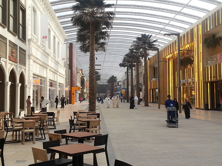
See Color RangeRequest SamplesSubmit Request