Wozoco Apartments by MVRDV Architecture – an original, inventive and colorful development in Amsterdam, The Netherlands
Cantilevered colors
The pure and most thoughtful minds are those which love color the most. – John Ruskin, The Stones of Venice, 1853, Volume II, Chapter V, Section 30.
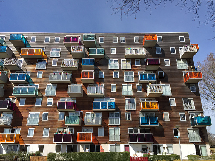
The first time I heard about the Wozoco Apartments was during my University studies. I remember thinking that the splash of color in the façade was a refreshing and creative approach towards architecture. The various window sizes and the façade elements arranged in a seemingly disorder play along with this young experimentalist methodology.
MVRDV’s choice regarding the materials also caught my attention; horizontal wooden boards wrapping most of the building – a material that ages with time – and coming out of the building, these colorful blocks made out of acrylic panels – a material well known for its aging resistance, a clash that results in a rich and interesting balance between old and new.

Wozoco Apartments, Amsterdam. The colorful Façade.
Photography by Ana Lopes Ramos
Same footprint, more apartments
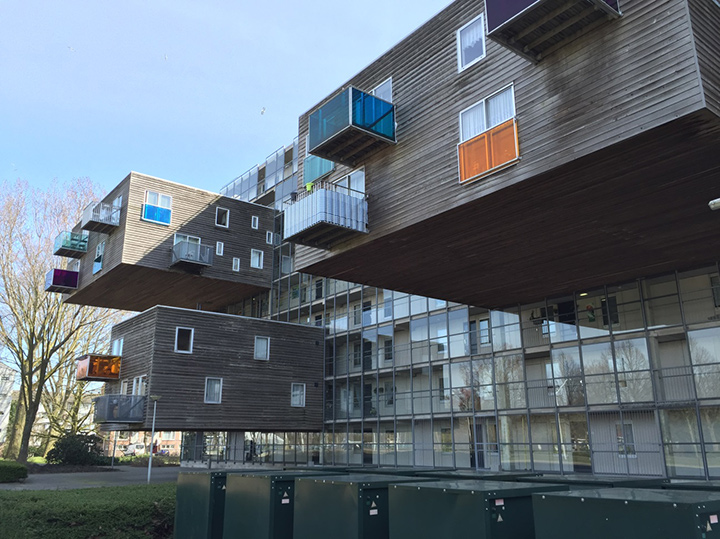
Soon I realized the project was more than just an interesting colored façade. It started with the program that sought for 100 apartment units in a plot where only 87 met the required daylight zoning regulations – the higher the building, the less sun for the surrounding buildings; the bigger the footprint, the less green and public space – so where to build? With no place to grow up nor sides, MVRDV came up with the idea of cantilevering the remaining 13 units.
The best place to hang the units was in the north façade, avoiding direct sunlight therefore avoiding shadowing the other apartments. These units burst from a gallery made of glass [a corridor that allows the residents to access their apartments]. The big scale of the blocks suspended in such a fragile material makes us wonder how the architects managed to cantilever them. They look lightweight, levitating in thin air; immediately our common knowledge of weight and gravity is putting this into perspective. The massive hidden structure in the core building is what keeps them from falling, a decision that brought up additional costs in the project, leading to some budget amendments.

Wozoco Apartments, Amsterdam. Units defying gravity.
Photography by Ana Lopes Ramos
After solving the program, these adjustments were crucial to the building’s design. The flats are organized in a very resourceful way. For sound insulation purposes, the partition walls were thickened up to 80mm, which enabled extra width to expand and reinforce the structure supporting the cantilevered blocks allowing the weight of the structural walls to remain the same. The costs of the materials were also adjusted; the facades and blocks were made of wood, acrylic and glass within a curtain wall system. The finishes were made roughly; the joints and some other details were exposed, offering an unfinished industrial look.
Denoting the entrance
The entrance was placed at the west side of the building; a block sticking out from the façade continues the core building’s pattern with two rows of five columns sustaining it, creating a double-height covered area. These elements of exception are commonly associated as main entrance features, a transition between exterior and interior. A glazed antechamber gives the inhabitants access to the building and their apartments. A steel gridded frame assembles the see-through wall contouring and blending with the North façade, encouraging the building to become a unity, a whole.
The ingenious approach gave MVRDV some awards including the Best Integrated Structure in a Building, being also pointed as one of the buildings constructed with the lowest costs in Amsterdam. An original and creative project that will always be known for its young and playful form, for bringing color and some joy into the real world of architecture.


