An examination of the design theory behind Seattle Central Library by OMA
Seattle, Washington, USA. 47°36′35″N 122°19′59″W
“In 1998, Seattle voters approved the Libraries for All bond issue, which provided for replacement or upgrade of all the branch libraries as well as a new Central Library. The International Style library building at 4th Avenue and Madison Street opened in 1960 and after almost 40 years of service, was at the end of its useful life. Koolhaas won a bid competition in May 1998 to submit a design for the new building.” – David Wilma (historylink.org/File/4163)
Seattle is known for being one of the cities with the most well educated population in the United States and it hosts an array of Fortune 500 companies such as Microsoft, Amazon, Boeing, Expedia or Starbucks. This fact remarks the kind of society that embraced such a daring idea. Each tribe selects its totems.

Seattle Central Library. Architects: OMA (Rem Koolhaas + Joshua Prince Ramus) and LMN Architects. Front elevation of the building where the cross bracing steel structure is seen behind the glass facade. The complex geometry responds to the local conditions such as views, orientation and urban density.
Image by Hoffman Construction Company.
An extraordinary building usually happens at a certain time at a certain place.
The 1990s and early 2000s were years of global economic bonanza and brought a handful of architecture masterpieces. Most of them followed the principles of the deconstructivist train of thought that most renowned architects were experimenting with at the time. Frank Gehry delighted us with the Guggenheim Museum in Bilbao; Zaha Hadid broke into the built architecture scene with the Vitra Fire Station; FOA designed and constructed Yokohama Ferri Terminal. My favourite of them all was the Seattle Public Library by OMA – Rem Koolhaas and Joshua Prince Ramus – in collaboration with the local firm LMN. I remember spending countless hours studying the plans, sections and diagrams that were published while developing my own final thesis project back in 2006.
The project was the result of an international competition that took place in 1998. It attracted 29 proposals from local, national and international offices. OMA won the commission among the five finalist teams that included Norman Foster, Cesar Pelli, Steven Holl and the Portland-based firm Zimmer Gunsul Frasca.
The concept behind the glass skin
Like all inventions, nothing is completely new. Every innovation is an evolution of a previous idea and in order to develop the concept of the library, Koolhaas rummaged into his obsession with Manhattan’s congestion and its skyscrapers. He took it as a starting point for the design of the library. According to him a skyscraper is a sequence of stacked floors on which anything can happen and functions can freely alternate from one floor to the next. This is exactly what happens in the Seattle Public Library.
The team of architects studied thoroughly the extensive brief of the library and decided to group functions according to their nature. They concluded that there were two types of programme functions: the stable ones, which required stable conditions and did not imply movement in themselves; and the unstable ones that were mainly spaces where any kind of exchange and movement could happen.
Those stable functions included the headquarters of the library, the book storage, meeting rooms, staff offices and the carpark. The unstable functions which imply a greater amount of movement of people across them were spread across the section of the building, placed above and below the floating boxes.

Seattle Central Library. Architects: OMA (Rem Koolhaas + Joshua Prince Ramus) and LMN Architects. Concept drawings showing a blocks diagram exploring the relationships between different parts of the programme and its direct translation into a section diagram of stacking boxes in space.
The diagrams as a design tool
Diagrams had been used in the past as a design tool that helped architects tackle complex programs that implied an intricate variety of adjacency relations within the different spaces of a building.
Koolhaas, together with other architects like Peter Eisenman or Bernard Tschumi to name a few, explored the possibilities that diagrams could offer when organising space and generating new spatial experiences by themselves.
Deconstructivist architects, named like this after the exhibition at the MOMA in New York curated by Phillip Johnson and Mark Wiggley in 1988, stretched the possibilities of this tool to the limit and many of their buildings became literal translation of such diagrams into constructed objects.
Loyal to this approach, Koolhaas and Ramus decided to translate the stable parts of the programme into boxes and place the unstable functions in between them.

Seattle Central Library. Architects: OMA (Rem Koolhaas + Joshua Prince Ramus) and LMN Architects. Concept drawings showing a blocks diagram exploring the relationships between different parts of the programme and its direct translation into a section diagram of stacking boxes in space.
The clever twist in architectural innovation
The turning point in the design comes when the sequence of boxes are accommodated in the three dimensional space. The boxes occupy different height levels but they also shift position in plan responding to the local and external conditions of the plot: be it the views of the bay, the mountains, the density of the urban fabric around it or the orientation of the building itself. The resulting pile of boxes is then wrapped in a glass and steel skin that encloses the terraced unstable function spaces.
The fact that a complex geometry building was conceived departing from a simple operation of stacking boxes in space is, probably, the aspect of the design that captivated me the most. Those unstable functions such as reading rooms or consultation rooms end up being contained in irregular geometry spaces in between the floating boxes and the inclined planes of glass that wrap them.

Seattle Central Library. Architects: OMA (Rem Koolhaas + Joshua Prince Ramus) and LMN Architects. Internal view of the lobby-living room. The steel mesh shapes the space of the unstable programmatic platforms of the building. Big size rugs ornamented with vegetal patterns define areas within the space.
Image by Hoffman Construction Company.
Structure
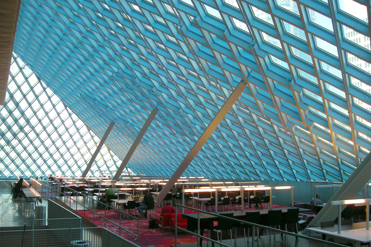
The concept of the structure combines two different systems. A regular grid of columns brings down the vertical loads to the foundations, replicating the free plan structural concept developed by the modernist architects of the twentieth century. The steel cage that wraps the boxes in space, defined as a diagonal mesh, will take the horizontal loads and stabilize the building against wind or seismic events. The skin of the building becomes its image but also its structure, and it does so in an uninhibited way. The steel elements change in size, density, orientation or even double up explicitly depending on the loads they need to resist. The structural stress diagrams become part of the aesthetic expression of the architecture.

Seattle Central Library. Architects: OMA (Rem Koolhaas + Joshua Prince Ramus) and LMN Architects. Internal view of the lobby-living room. The steel diagonal mesh stabilizes the building against the wind and seismic loads. Painted in white, it offers an ever changing image of the internal space as the light reflects on its surfaces.

Seattle Central Library. Architects: OMA (Rem Koolhaas + Joshua Prince Ramus) and LMN Architects. Internal view of the lobby-living room. The steel diagonal mesh stabilizes the building against the wind and seismic loads. Painted in white, it offers an ever changing image of the internal space as the light reflects on its surfaces.
Inside the Boxes
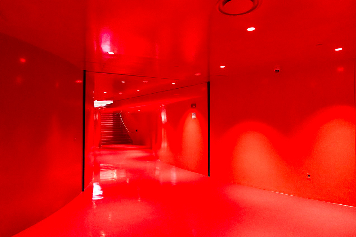
The visitors are offered a different kind of experience inside each of the programmatic boxes. The “Assembly” box containing meeting rooms for public hire is entirely painted in bright red. Corridors and rooms are enclosed with curvy shapes recreating the experience of circulating through the veins and organs inside a body.
The Books box is in a continuous spiral which allows the books to be ordered in a linear system. One could think of it as an adaptation of the car park typology into the heightened purpose of containing shelves with books and knowledge showing one more time those intelligent shifts that distinguish OMA’s work.

Seattle Central Library. Architects: OMA (Rem Koolhaas + Joshua Prince Ramus) and LMN Architects. Internal view of the corridor at the meeting rooms box. Every surface is painted in red and the curvy geometry suggests to visitors that they are circulating inside a body.


